
The best shelves feel collected, edited, and useful: a balance of books, art, objects, light, texture, and empty space that shows taste without clutter.
- Start With Books in Mixed Orientations
- Lean Small Artwork Behind Objects
- Repeat One Ceramic Color Family
- Use Negative Space as a Design Element
- Add a Small Picture Light or Shelf Lamp
- Vary Height With Tall Branches
- Group Objects in Uneven Numbers
- Let One Sculptural Piece Stand Alone
- Hide Visual Clutter in Matching Boxes
- Display Collections With a Tight Edit
- Place Heavier Pieces on Lower Shelves
- Style Kitchen Shelves With Useful Beauty
- Layer Framed Photos With Restraint
- Use Plants Where the Light Is Real
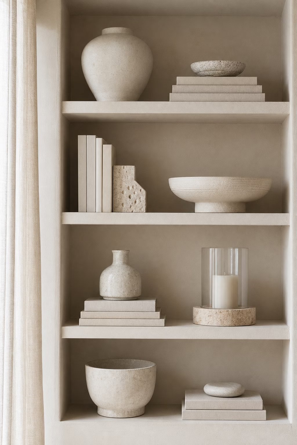
- Create a Quiet Monochrome Shelf
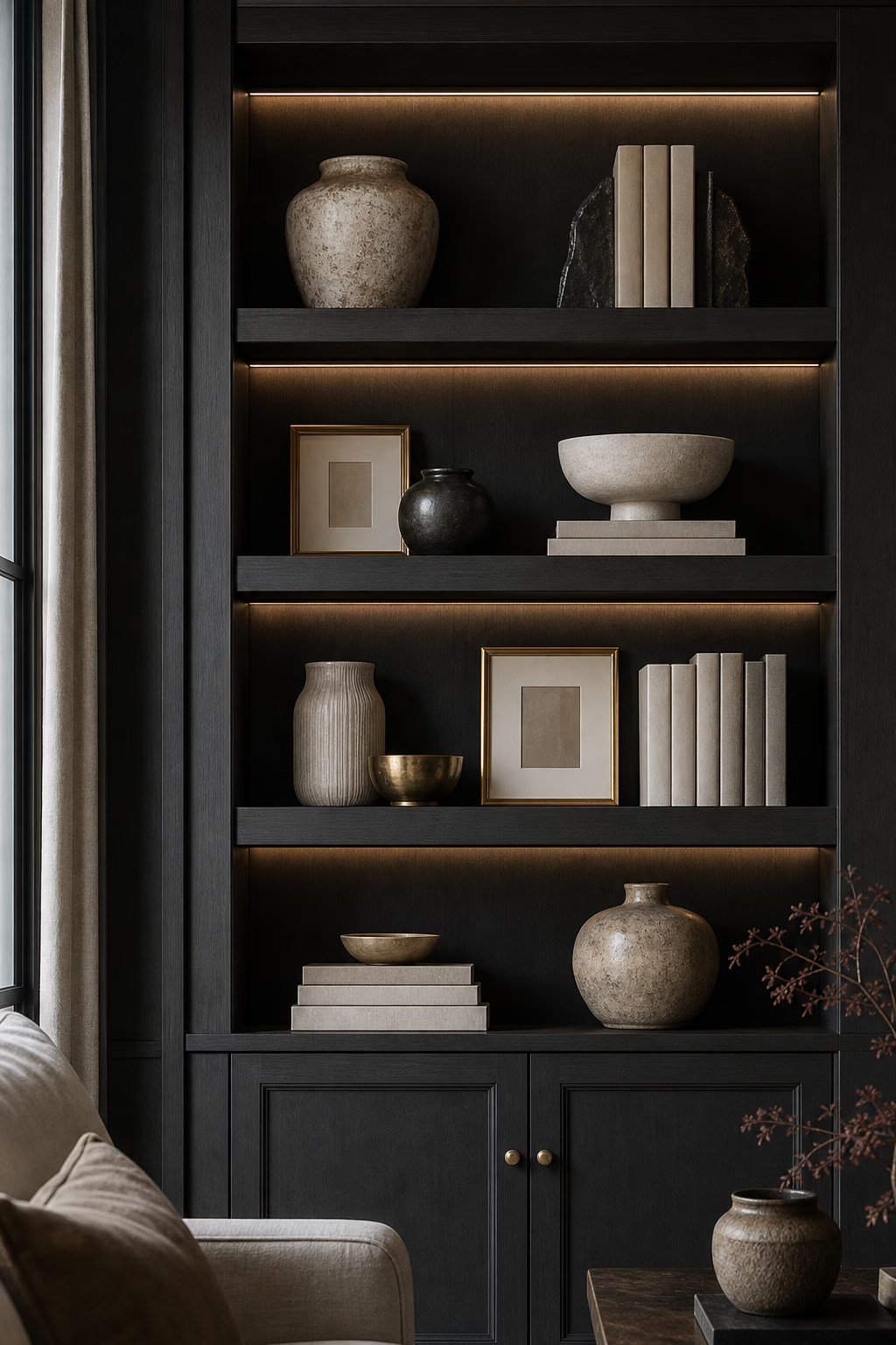
- Let Dark Shelves Feel Moody and Intentional
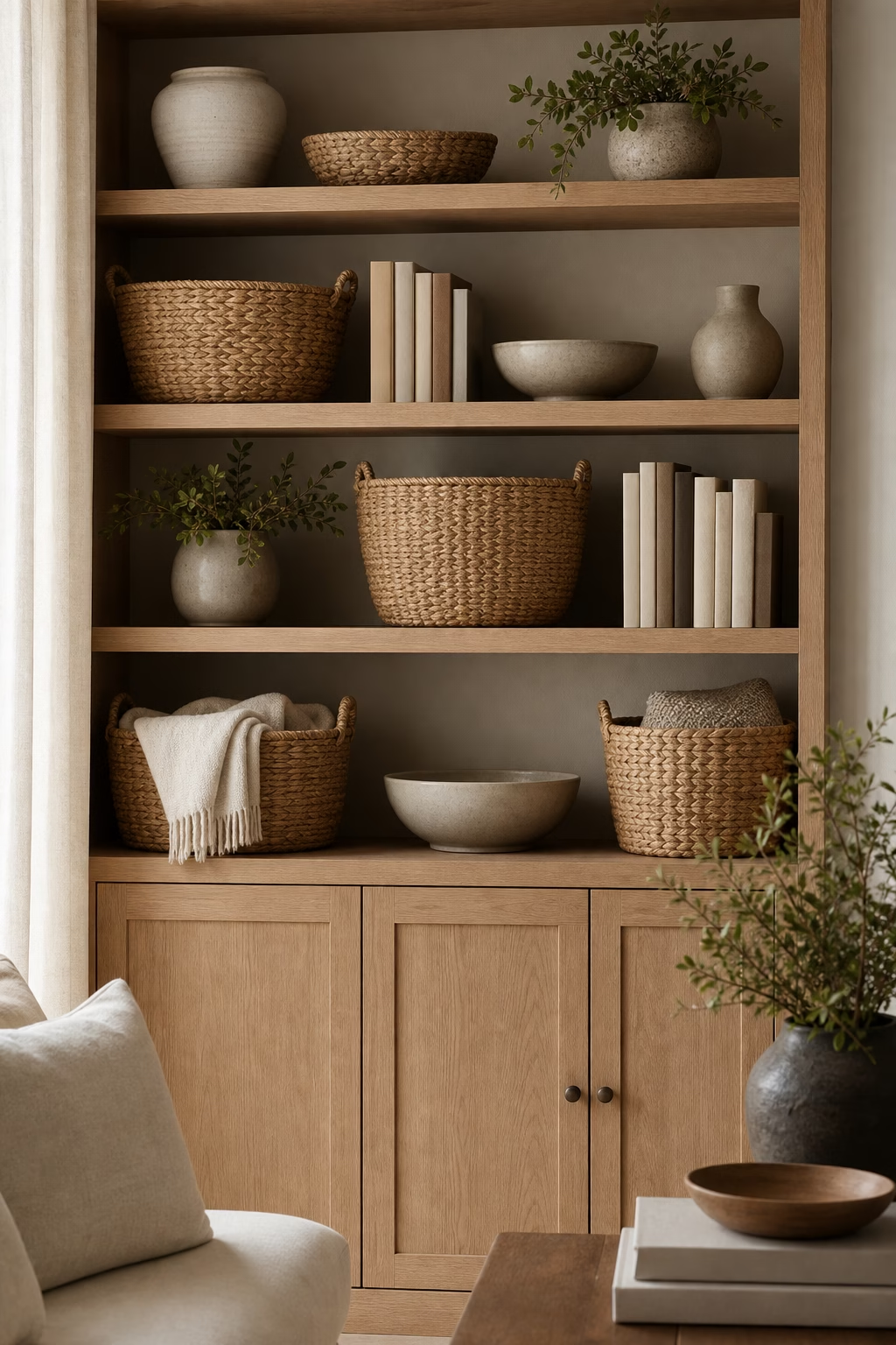
- Use Baskets for Texture, Not Just Storage
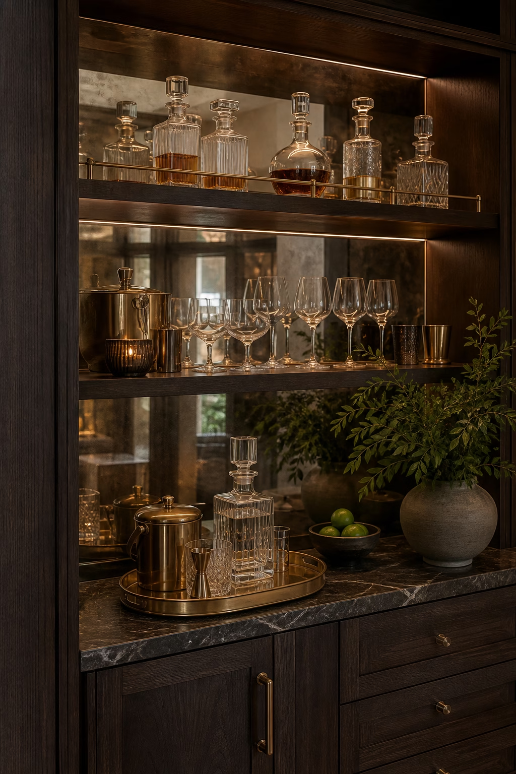
- Turn Bar Shelves Into a Polished Moment
- Angle a Few Books for Casual Movement
- Repeat Materials From the Room
- Keep Seasonal Decor Quiet and Swappable
- Finish by Editing From Across the Room
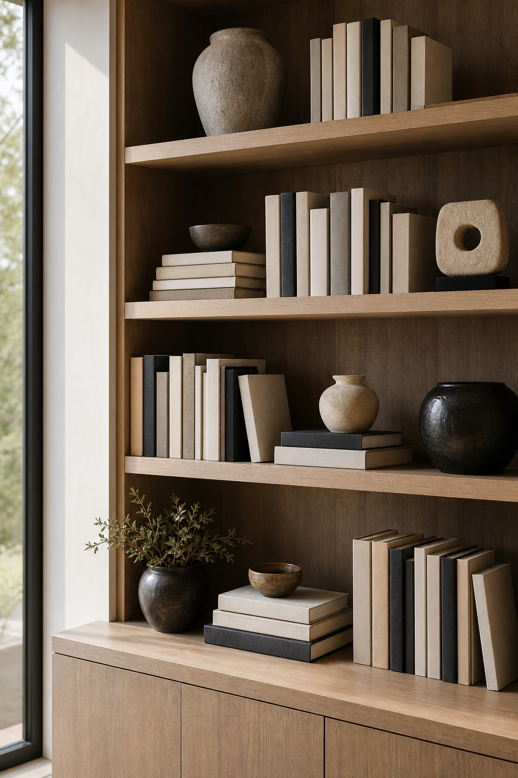
Start With Books in Mixed Orientations
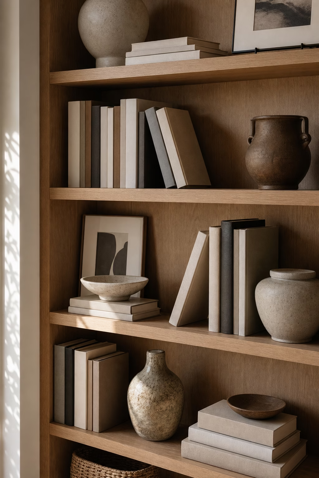
Books give shelves weight, rhythm, and a sense of real life. Instead of lining every volume vertically, mix upright rows with horizontal stacks that can support a vessel, small sculpture, or framed photo. Keep the stacks low enough that they still look usable; shelves become stiff when books turn into purely decorative blocks. Arrange by tone only if the covers are very busy, but do not erase personality completely. A few well-worn spines make the display feel collected rather than staged. Leave small gaps between groupings so the eye can pause. Once books create the structure, every other object has a more natural place to land.
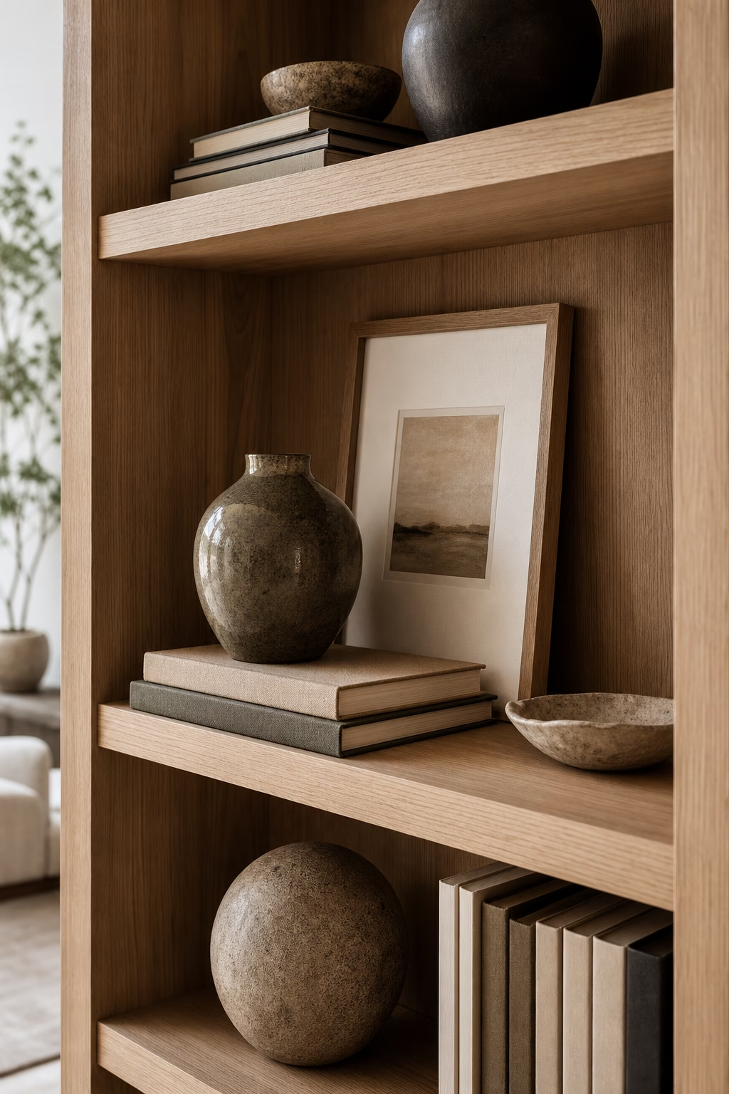
Lean Small Artwork Behind Objects
Leaning art gives shelves depth because it creates a background layer without requiring another wall. Use small paintings, sketches, framed textiles, or photography behind ceramics, books, and boxes. The frame should be stable and proportionate to the shelf depth, with enough height to rise above the objects in front. This is a good place for pieces that are too small to command a wall alone but too meaningful to store away. Vary the frame finishes if the room already feels collected, or repeat one finish for a cleaner effect. The art makes each shelf feel like a vignette rather than a row of objects.
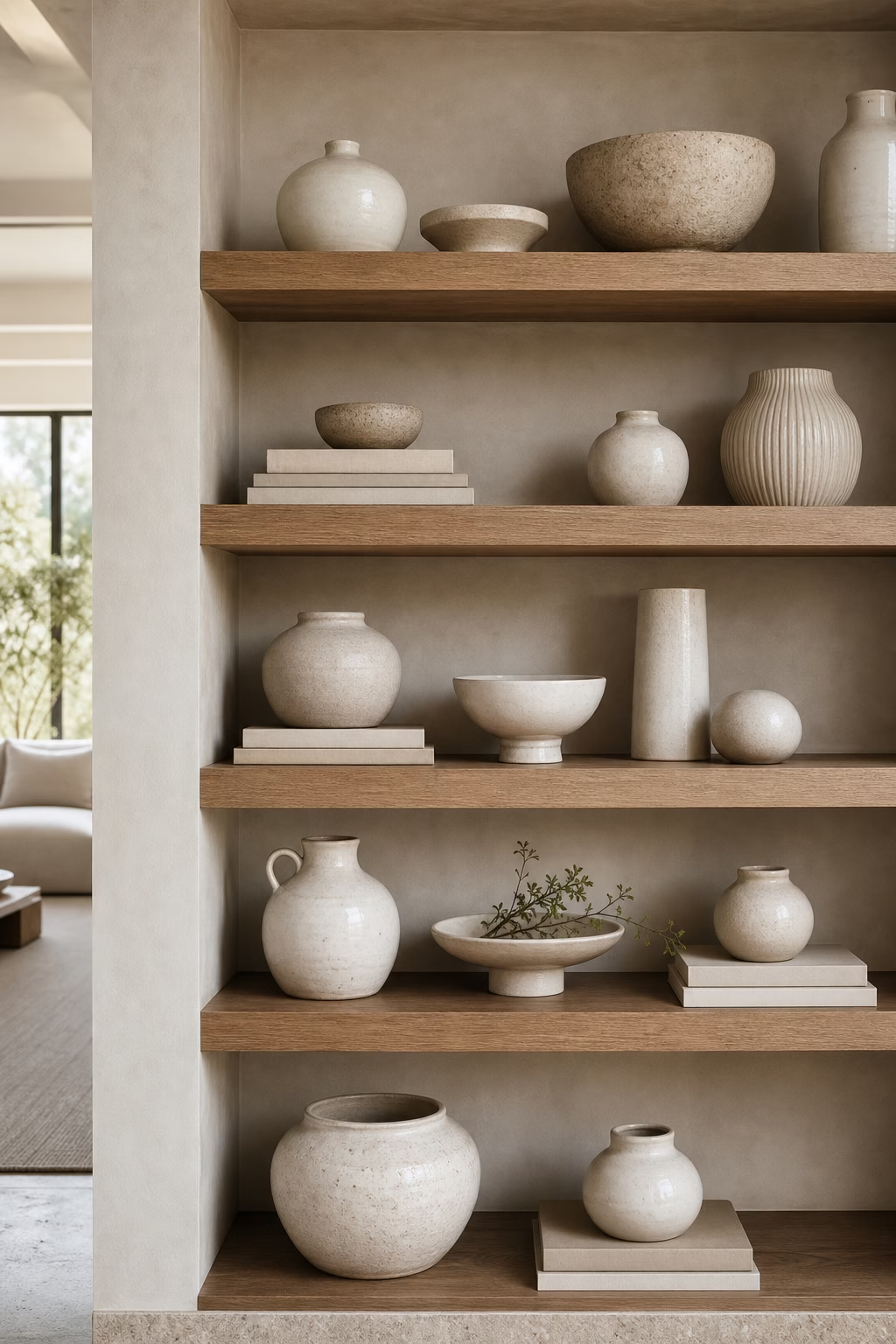
Repeat One Ceramic Color Family
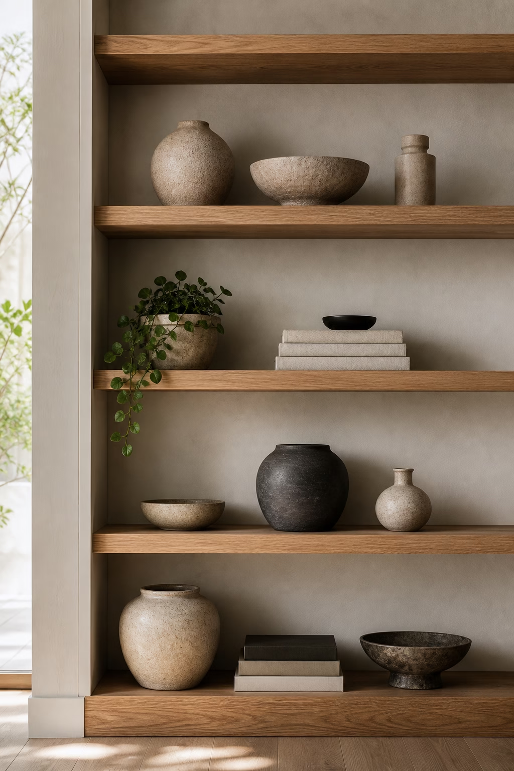
Ceramics bring handmade texture to shelf decor, but they look most sophisticated when they share a color family. Choose pieces in chalk, stone, black clay, celadon, terracotta, or warm white, then vary the forms: one tall vase, one low bowl, one lidded jar, and a smaller sculptural piece. Repetition keeps the shelf calm while the silhouettes keep it from feeling matched. Avoid filling every cubby with a different accent color. If your books already introduce many tones, a consistent ceramic palette will pull the whole display together. The effect is quiet, tactile, and personal without sliding into clutter, especially when the glaze catches light differently from shelf to shelf.
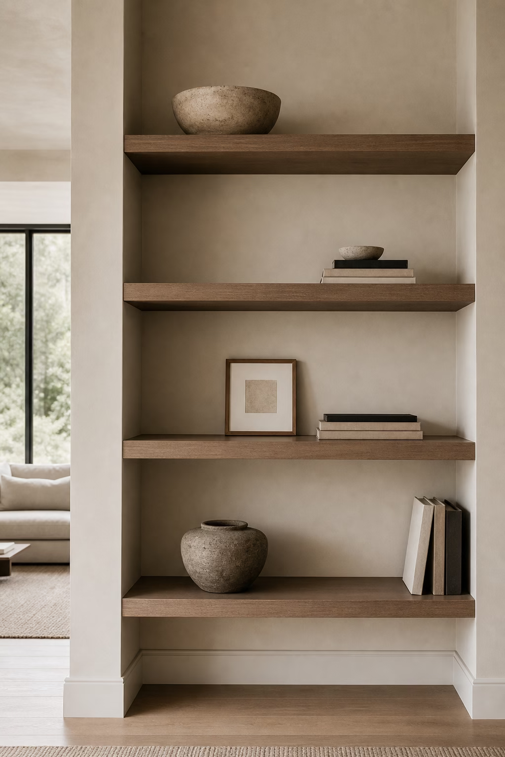
Use Negative Space as a Design Element
The most common shelf mistake is treating every inch as storage. Negative space is what lets the best objects look important. After placing books and larger pieces, leave a few openings almost empty: perhaps one bowl centered on a shelf, or a single sculpture with space around it. This breathing room makes built-ins feel more architectural and less like a retail display. It also helps the room feel calmer from a distance. If empty space feels awkward, align it with other gaps so the shelf wall has rhythm. Editing is not the same as having less style; it is what allows style to be seen clearly.
Add a Small Picture Light or Shelf Lamp
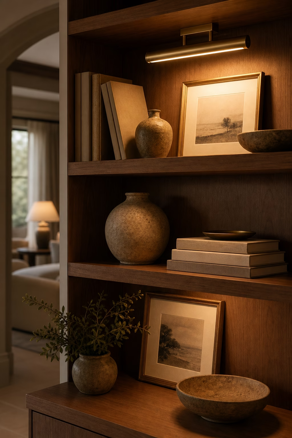
Lighting turns shelves from storage into atmosphere. A tiny rechargeable lamp, integrated LED strip, or picture light can make ceramics, books, and art glow in the evening. Keep the light warm and low, more like candlelight than task lighting. If the shelves are built in, conceal wiring during installation and place fixtures where they wash the objects rather than glare into the room. On freestanding shelves, a small shaded lamp can look charming if the cord is hidden. Light is especially useful on dark shelves or in rooms without much natural brightness. It gives the display a finished, hospitality-level polish.
Vary Height With Tall Branches
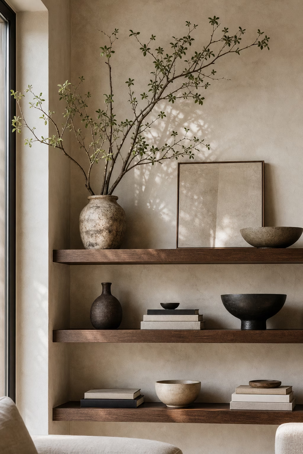
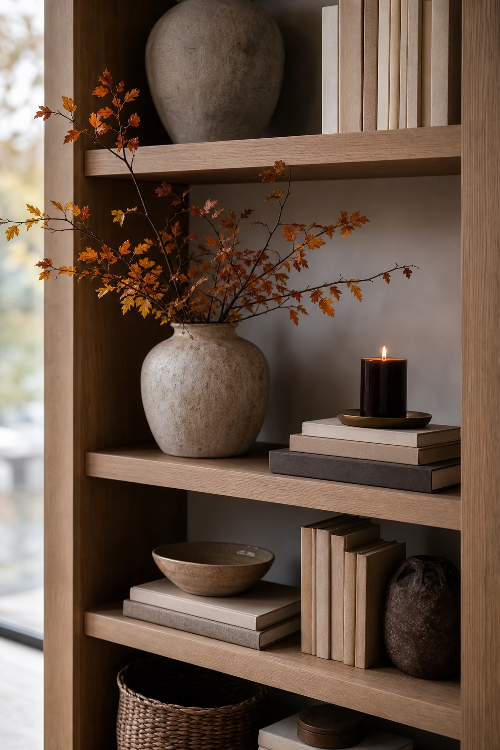
Tall branches are ideal for shelves because they bring height without visual heaviness. Place them in a simple vase on an open upper shelf or at one end of a console-style bookcase where they can rise into empty wall space. Olive, eucalyptus, beech, magnolia, or bare sculptural branches all work depending on the season and room. Keep the arrangement loose and asymmetrical so it feels natural. The vessel should be heavy enough to stay stable and narrow enough not to dominate the shelf depth. Branches also soften hard lines, which is useful when shelving is very rectilinear or filled with books.
Group Objects in Uneven Numbers
Uneven groupings often feel more natural because they avoid the stiffness of perfect pairs. Try a trio: one tall object, one medium piece, and one low horizontal stack. The objects do not need to match, but they should share something, such as color, material, or mood. A stone bowl, ceramic vase, and linen-covered book can feel connected even if their shapes differ. Leave enough room between groupings so each one reads as a small composition. This approach is useful for open shelves, kitchen shelves, and bookcases because it gives you a simple rule without making the display feel formulaic.
Let One Sculptural Piece Stand Alone
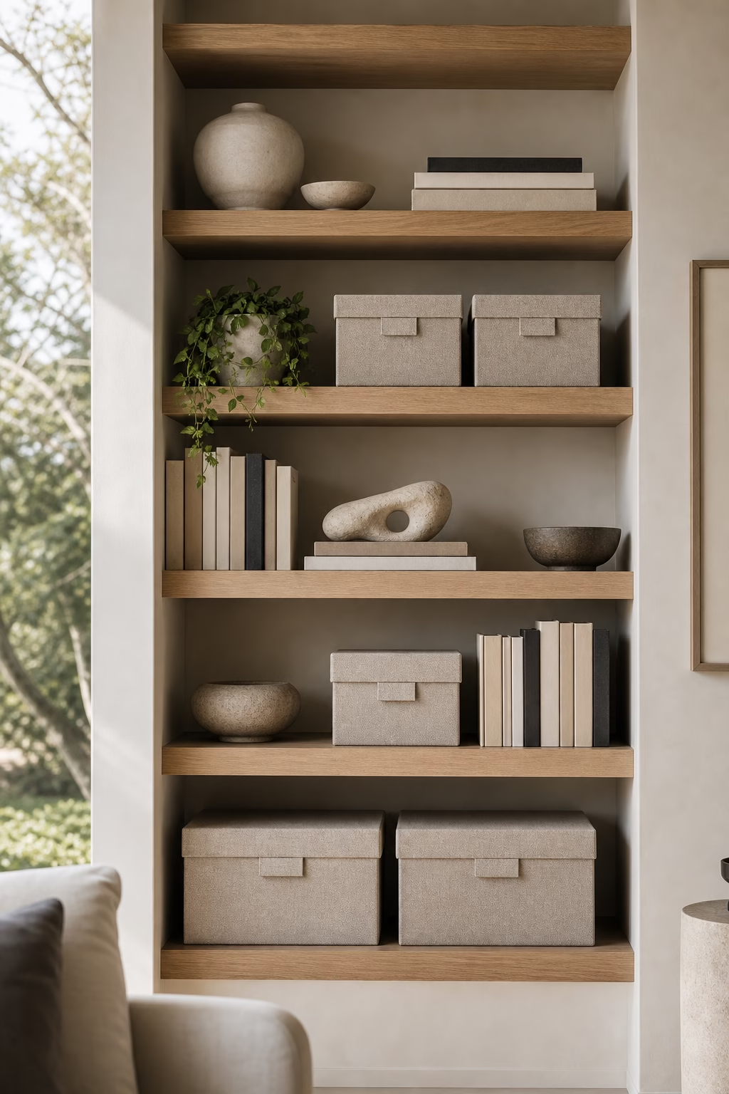
A single sculptural object can do more for a shelf than a dozen small accessories. Choose a piece with strong shape, texture, or shadow: carved wood, ceramic, stone, bronze, or glass. Give it room on all sides so it reads as a focal point, not a leftover. This is especially effective on shelves at eye level, where the object can be appreciated from across the room. If the piece is dark, place it against a lighter background; if it is pale, set it near books or wood for contrast. The restraint makes the shelf feel confident and gives the object the dignity it deserves.

Hide Visual Clutter in Matching Boxes
Shelves often have to hold real life: remotes, chargers, stationery, receipts, game pieces, and spare cords. Matching boxes keep those practical items accessible without letting them dominate the room. Choose linen, leather, lacquer, woven fiber, or sturdy paper boxes depending on the shelf style. The boxes should fit the depth properly and leave a little space above for easy handling. Use two or three together rather than scattering many different containers across the bookcase. If labels are necessary, keep them discreet and on the underside or inside lip. Closed storage is the reason open shelving can stay beautiful over time.
Display Collections With a Tight Edit
Collections can be wonderful on shelves when they are edited hard enough to show intention. Instead of displaying every shell, bowl, camera, or vintage find, choose the strongest pieces and group them with space around them. Repetition is what makes a collection feel elevated: similar shapes, related colors, or one material family. Keep the rest stored and rotate pieces seasonally if you enjoy variety. A tight edit prevents the shelf from looking like storage and lets the collection tell a clearer story. This works for inherited objects too; fewer pieces often make the sentimental ones feel more important and easier to appreciate.
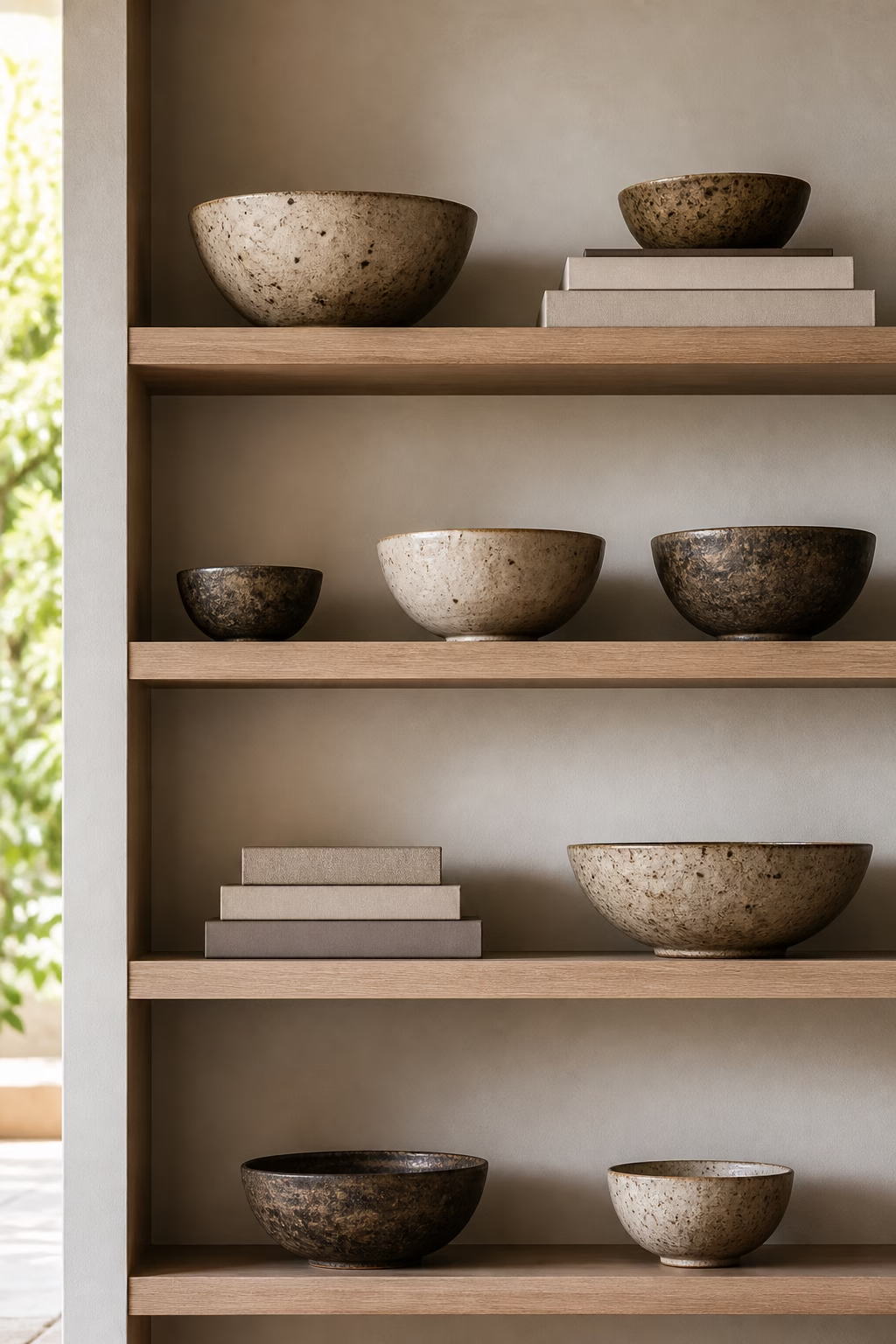
Place Heavier Pieces on Lower Shelves
Shelf styling has a visual gravity that matters. Heavier objects belong lower, where they make the whole display feel grounded and stable. Use the bottom shelves for baskets, larger books, stone bowls, storage boxes, or substantial vessels. Place lighter ceramics, small art, and delicate glass higher up. This is practical as well as beautiful, since heavy items are easier and safer to reach when they are lower. The rule does not need to be rigid, but it helps tall shelving avoid a top-heavy look. When weight is distributed well, the bookcase feels calm even if it holds many different things.
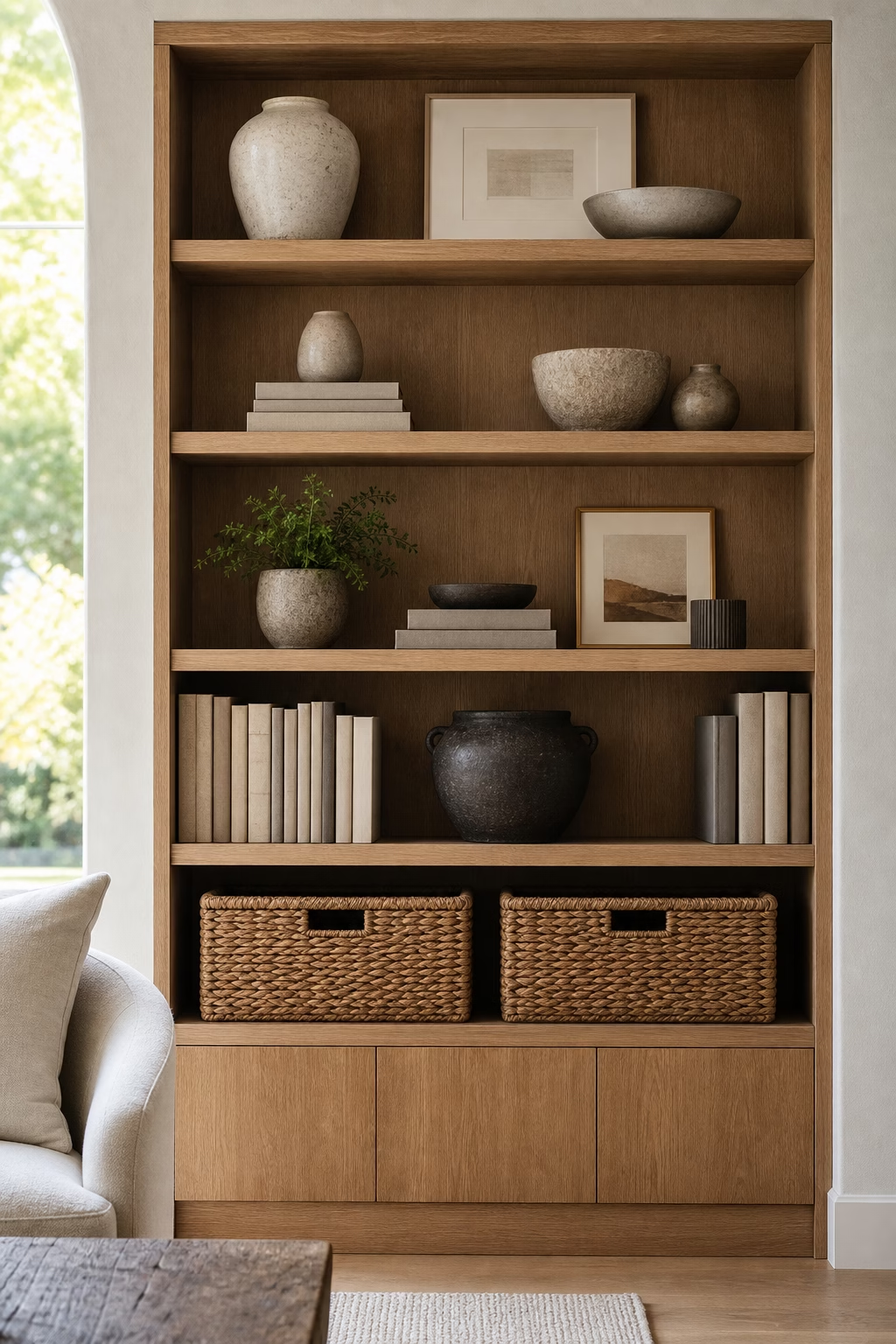
Style Kitchen Shelves With Useful Beauty
Kitchen shelves should look good, but they also need to earn their place. Use them for objects that are both useful and attractive: everyday plates, glassware, a favorite pitcher, a stack of linen napkins, a pepper mill, or a bowl of citrus. Keep the color range tight so practical items feel intentional. Place frequently used pieces on lower shelves and decorative pieces higher up, where dust and reach are less of an issue. Avoid overcrowding, because kitchens already carry many visual details. When open shelves hold useful beauty, they make cooking easier and give the room a relaxed, lived-in elegance.
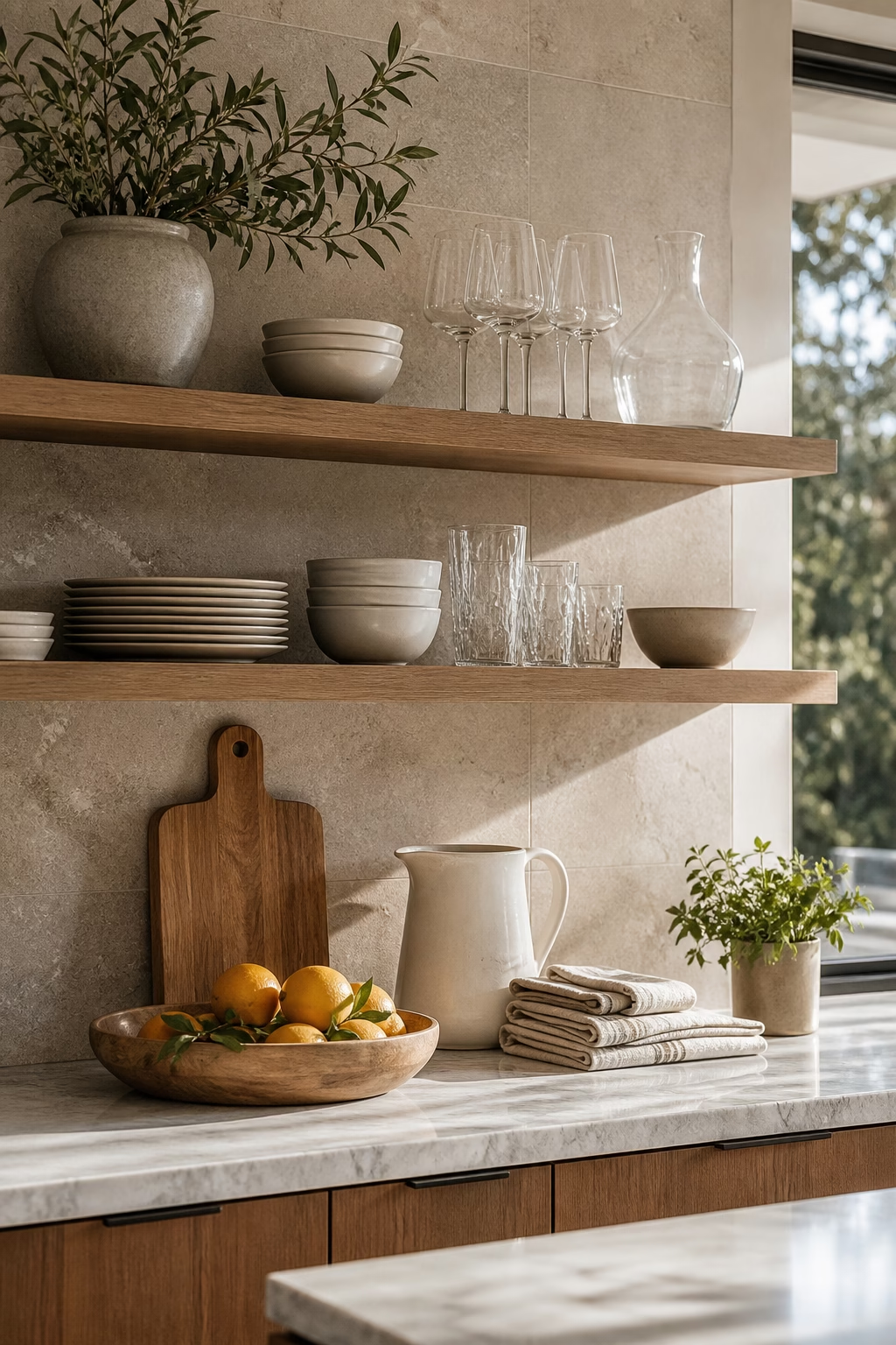
Layer Framed Photos With Restraint
Family photos can absolutely belong on styled shelves, but they look best when treated with the same restraint as art. Choose a few meaningful images rather than filling every gap, and use frames that relate to the room: thin black, warm oak, brass, or simple silver. Mix one standing frame with books or a small vessel so it feels integrated, not isolated. Black-and-white prints can unify photos from different moments, while color images work well if the surrounding objects are quiet. Leave space around each frame. The goal is warmth and identity, not a crowded archive of every memory.

Use Plants Where the Light Is Real
Plants can make shelves feel alive, but they should be placed where they can actually thrive. Put trailing pothos, hoya, or philodendron near a bright side of the shelf, and use upright plants only when there is enough clearance above. If natural light is weak, choose cut branches or dried botanicals instead of forcing a struggling plant into the vignette. The planter matters: ceramic, stone, metal, or woven cachepots should connect to the rest of the shelf. Avoid tiny pots sprinkled everywhere. One healthy plant with room to grow looks more elegant than several unhappy ones used as visual filler.
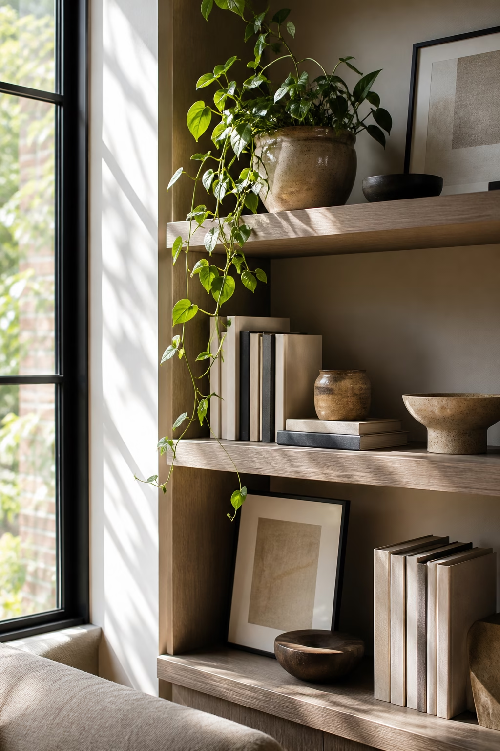
Create a Quiet Monochrome Shelf
A monochrome shelf can be striking if it relies on texture rather than flat sameness. Choose one color family, such as warm white, charcoal, sand, or deep green, then vary the materials: linen book covers, matte ceramics, glossy glass, carved stone, and painted wood. The differences in finish keep the display from looking like a single block. This works beautifully in small rooms, where too many colors can make shelves feel busy. Add one natural element, such as a branch or bowl, if the arrangement needs softness. Monochrome styling is not about removing personality; it is about making texture and shape do the talking.
Let Dark Shelves Feel Moody and Intentional
Dark shelves can look deeply elegant when the styling is edited and well lit. Paint the interior charcoal, espresso, deep olive, or inky blue, then use objects with enough contrast to show their shapes: pale ceramics, brass frames, cream books, or clear glass. Add a small light if the room is dim, because dark shelving can swallow detail. Keep the arrangement less crowded than you would on pale shelves; negative space becomes more dramatic against a dark background. This approach is ideal for libraries, dining rooms, bars, and studies. It turns storage into a moody architectural feature with real evening presence.
Use Baskets for Texture, Not Just Storage
Baskets are practical, but their texture is just as valuable. A woven box or lidded basket can break up rows of hard books, glossy ceramics, and flat cabinet fronts. Choose materials that suit the room: seagrass for relaxed spaces, rattan for warmth, cane for a tailored look, or dark woven fiber for contrast. Keep the shapes simple and repeat them where possible. On lower shelves, baskets can hold blankets, toys, cables, or office supplies. On higher shelves, one empty basket can still be worthwhile because it introduces a natural surface. The weave adds shadow and softness that shelves often need.
Turn Bar Shelves Into a Polished Moment
Bar shelves can look glamorous without becoming busy. Start with the best glassware, a decanter or two, and a tray that defines the serving zone. Keep bottles edited, grouping by height or label tone if they are visible. Add one small lamp, mirror backing, or metallic detail to catch light, but avoid making every surface reflective. The shelves should still feel useful: glasses easy to reach, tools contained, and open space for pouring. In a dining room or living room, a polished bar shelf creates hospitality without needing a full built-in bar. It says the room is ready, not overworked.
Angle a Few Books for Casual Movement
A perfectly straight shelf can feel static, especially when every object is lined up at the same depth. Angling a few books or leaning a small stack gives the display a relaxed movement while still looking considered. Use this sparingly, in one or two places, so it feels natural rather than messy. A leaning book can bridge a vertical row and a horizontal stack, or soften a very square cubby. Keep valuable books supported so spines do not warp over time. The effect is subtle, but it helps shelves feel lived in, which is often what separates elegant styling from a showroom arrangement.
Repeat Materials From the Room
Shelves look more integrated when they repeat materials already present in the room. If the coffee table is travertine, add a small stone bowl. If the lighting is brass, use a brass frame or object. If the sofa is linen, bring in linen-covered boxes or books. These echoes do not need to match exactly; they simply make the shelves feel connected to the larger design. This is especially helpful with built-ins, which can otherwise feel like a separate display wall. Repeating materials creates continuity and keeps the styling from becoming a random collection of attractive objects without context.

Keep Seasonal Decor Quiet and Swappable
Seasonal shelf decor works best when it changes the mood without taking over the room. Instead of overt signs or novelty pieces, swap in natural branches, a darker candle, a woven pumpkin, a bowl of winter citrus, or a vase in a seasonal color. Keep the base styling in place and change only a few objects, so the shelves still feel like your home. This also makes storage easier because you are not packing away an entire display four times a year. Quiet seasonal changes are more elegant and more sustainable. They let the shelves breathe with the calendar while staying refined.
Finish by Editing From Across the Room
The final shelf styling step should happen from a distance. Stand across the room and look for uneven weight, repeated shapes, crowded patches, or empty gaps that feel accidental. A shelf can look perfect up close and chaotic once seen as part of the whole wall. Remove one or two pieces before adding anything else; editing usually improves the composition faster than shopping. Check how the shelves look in daylight and at night with lamps on. If the eye moves comfortably across the display and nothing screams for attention, the styling is working. The best shelves show taste with confidence, not effort.
