Beautiful blue kitchen design ideas that show how navy, powder blue, teal, slate, tile, stone, hardware, and styling can feel polished and timeless.
- Choose Inky Navy for a Tailored Cabinet Wall
- Pair Powder Blue Cabinets With Honed Stone
- Use Blue on the Island Only
- Try Blue-Gray for a Quiet Transitional Look
- Run Blue Tile From Counter to Ceiling
- Choose a Blue Range for a Confident Focal Point
- Mix Denim Blue With Warm Oak
- Use Slate Blue With Blackened Metal Details
- Create a Coastal Blue Kitchen Without Cliches
- Let a Blue Pantry Niche Add Depth
- Balance Blue Cabinets With Cream Walls
- Add a Blue Stone or Quartzite Counter
- Paint Lower Cabinets Blue and Keep Uppers Light
- Use Teal Blue for a Rich Jewel-Box Mood
- Frame Blue Cabinets With Marble-Look Slabs
- Choose Brass Hardware That Feels Quiet
- Use Blue Open Shelving as an Accent
- Combine Blue With Stainless for a Cleaner Edge
- Use Pale Blue in a Small Kitchen
- Anchor Blue Cabinets With Dark Floors
- Create a Blue Bar Area Beside the Kitchen
- Layer Blue With Patterned Floor Tile
- Use Blue Inside Glass-Front Cabinets
- Finish With Blue Textiles and Ceramics
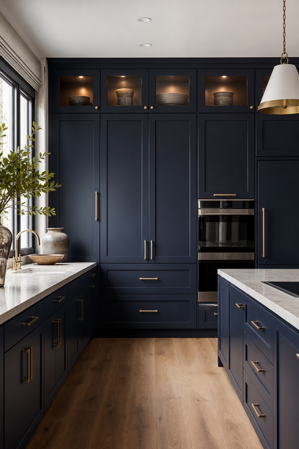
Choose Inky Navy for a Tailored Cabinet Wall
Inky navy works best when it is treated as architecture rather than a decorative color. Use it on a full cabinet wall, pantry bank, or island base with simple door profiles and disciplined hardware. The depth gives a kitchen formality, but it needs balance: pale stone, warm wood, and good daylight keep the color from feeling heavy. A satin finish usually looks richer than high gloss because it catches light softly across large doors. Test the paint beside the floor and countertop before committing. Navy should feel tailored and permanent, not like a trend applied at the end of the project.
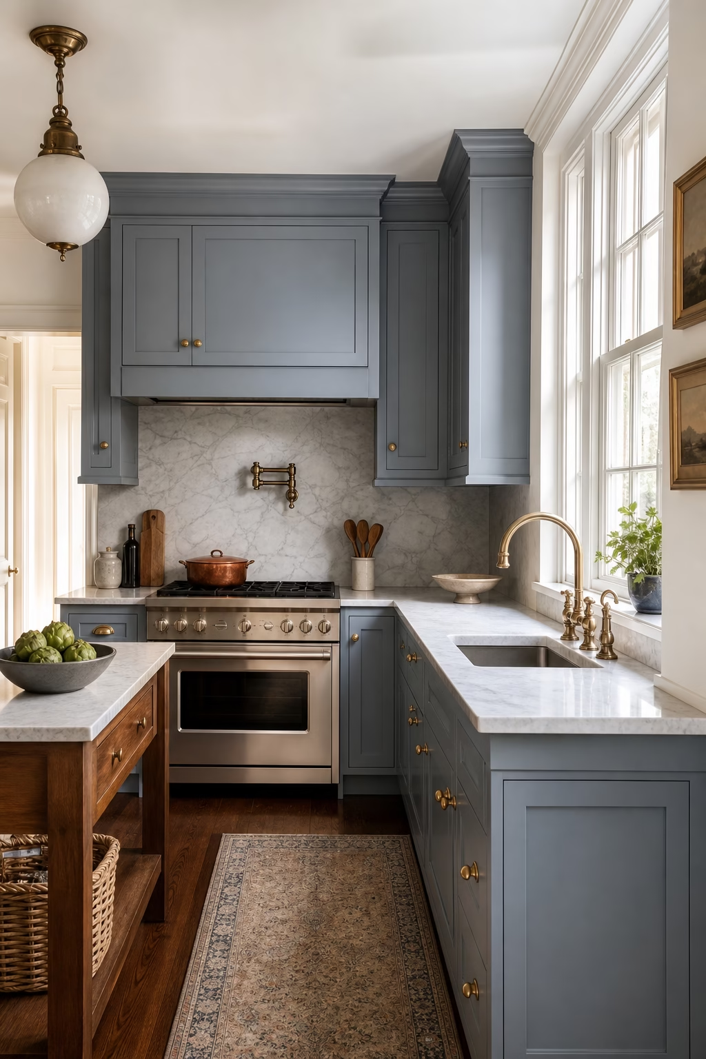
Pair Powder Blue Cabinets With Honed Stone
Powder blue can look sophisticated when the surrounding materials have enough weight. Pair soft blue cabinetry with honed marble, limestone-look quartz, or quiet quartzite so the palette feels grounded rather than sweet. Keep the door style clean and avoid overly cute hardware. The shade is especially useful in smaller kitchens because it brings color while still reflecting light. Add a little warmth through oak floors, brass details, or woven counter stools if the room starts to feel cool. The goal is not a pastel kitchen, but a calm, airy space where blue behaves like a refined neutral. Test samples beside morning light.

Use Blue on the Island Only
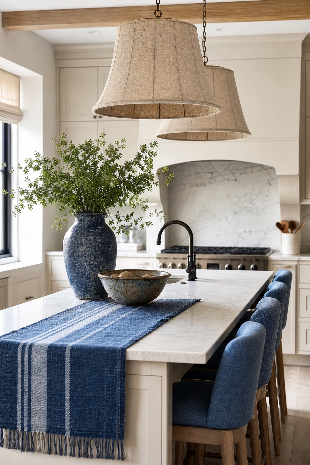
A blue island is the most flexible way to bring color into a kitchen without committing every cabinet to it. It works especially well when the perimeter is white oak, warm white, mushroom, or soft gray. Choose a blue with enough depth to anchor the room, then repeat it subtly in a runner, ceramic vase, or nearby artwork so it does not feel isolated. The island should still be sized for real circulation and seating; color cannot fix an oversized block. With a tailored stone top and clean stools, a blue island becomes the room's center of gravity without overwhelming the daily work zones.

Try Blue-Gray for a Quiet Transitional Look
Blue-gray is ideal when you want color that still feels calm beside traditional details. It softens shaker doors, marble counters, and warm metal hardware without pushing the kitchen into a coastal theme. Look for a shade with a little gray or green in it so the cabinets relate to stone, stainless, and wood. This color also works beautifully in older homes where pure white cabinetry can feel too new. Keep the backsplash simple and let the cabinet color do the work. Blue-gray gives the kitchen a lived-in elegance that photographs well and ages more gracefully than brighter blues. It also forgives daily fingerprints.
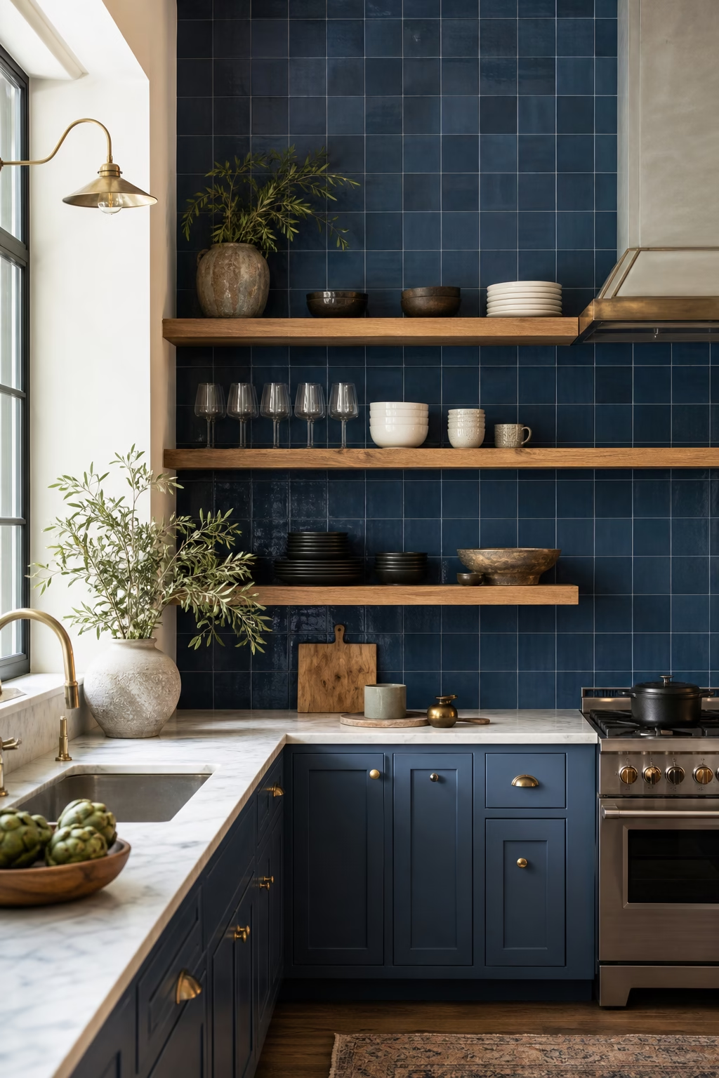
Run Blue Tile From Counter to Ceiling
Blue tile has the most impact when it is used with architectural confidence. Running it from the counter to the ceiling on a sink wall or range wall creates a finished surface that feels intentional. Choose a tile with variation, such as handmade-look ceramic or zellige-inspired glaze, so the color has movement in natural light. Keep the cabinetry quieter if the tile is saturated. A close-toned grout will make the wall feel smoother, while a slightly deeper grout emphasizes the grid. This idea is especially strong in kitchens with open shelving because the blue becomes a luminous backdrop for everyday dishes.
Choose a Blue Range for a Confident Focal Point
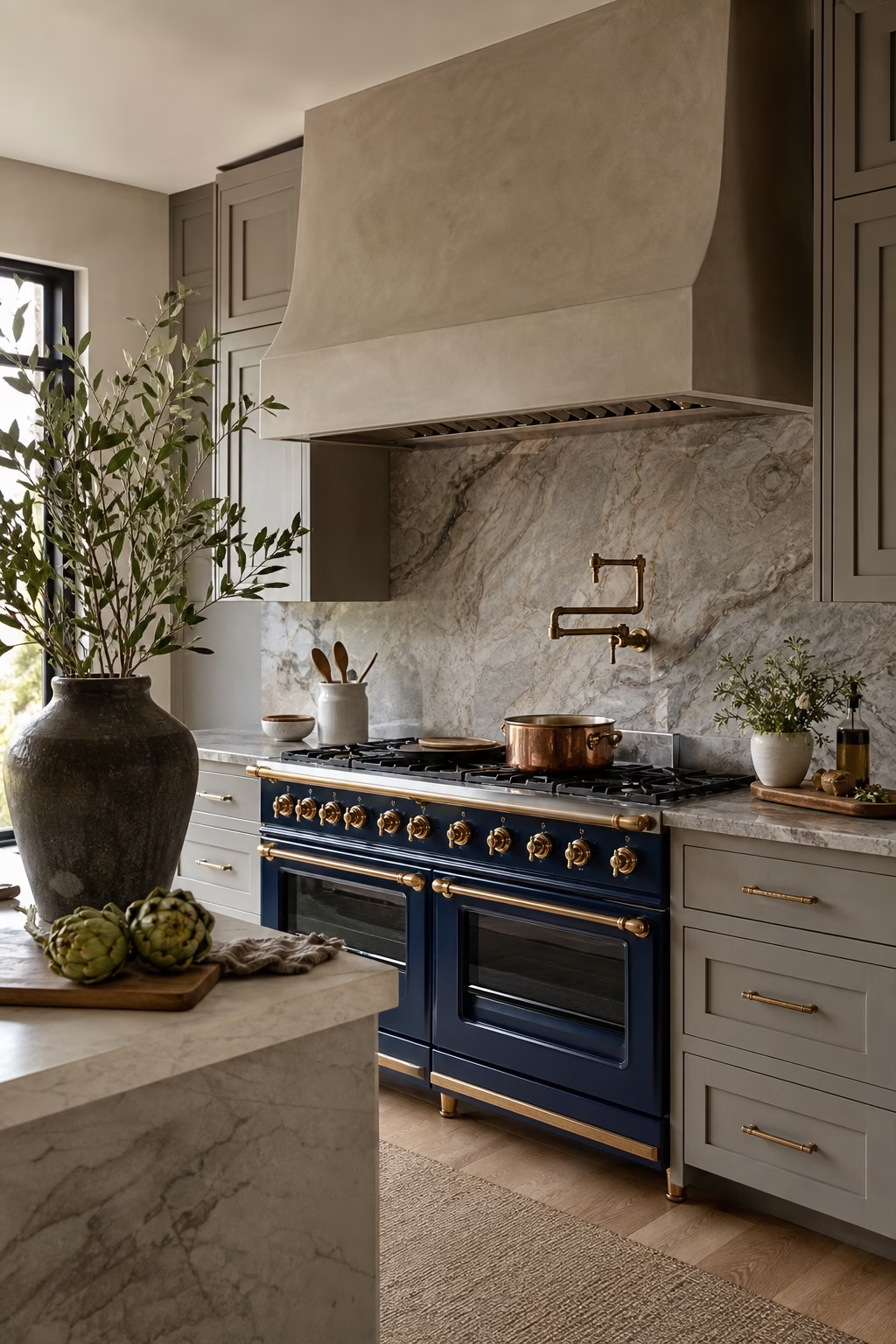
A blue range can be glamorous, but it needs a disciplined setting. Surround it with quiet cabinetry, a serious hood, and a backsplash that does not compete for attention. Deep cobalt, navy enamel, or muted slate blue feels more enduring than a novelty shade. Make sure the range is properly scaled to the room; a large professional model can overwhelm a modest kitchen if the ventilation and landing space are not handled. Repeat the blue only once or twice elsewhere, perhaps in a small ceramic piece or island detail. The focal point should feel collected, not staged around one appliance.
Mix Denim Blue With Warm Oak
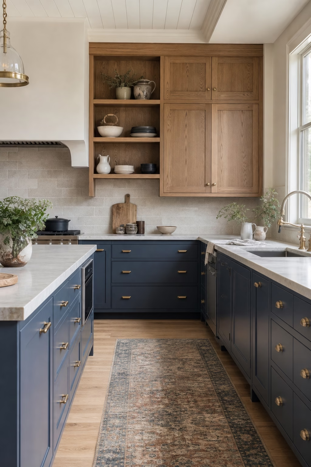
Denim blue and warm oak create a relaxed kitchen that still feels elevated. The blue brings softness, while oak adds grain, warmth, and a connection to furniture. Use blue on painted lower cabinets and oak on uppers, tall storage, shelving, or a breakfast bar. Keep the stone simple so the two materials do not have to compete. This palette is particularly effective in open-plan spaces because it bridges kitchen function and living-room comfort. Choose hardware with a quiet finish, such as aged brass or brushed nickel. The result feels approachable, but not casual to the point of losing polish. Keep grain direction consistent.
Use Slate Blue With Blackened Metal Details
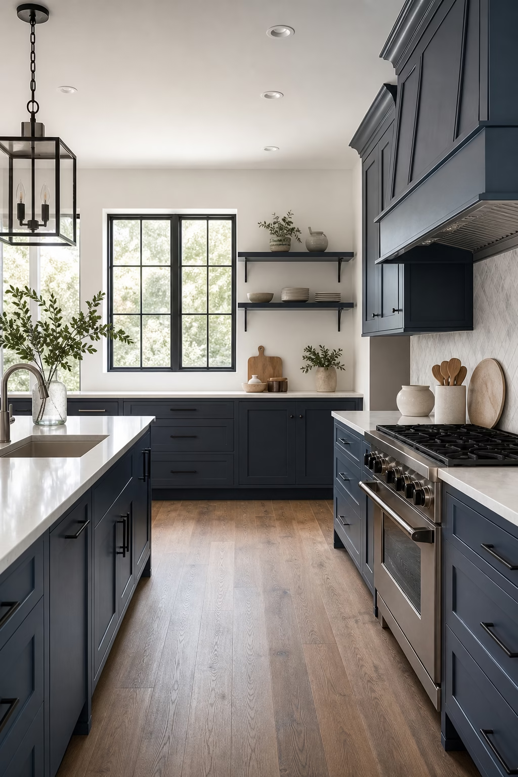
Slate blue becomes sharper when it is paired with blackened metal in small, precise doses. Thin pulls, shelf brackets, pendant stems, or a dark window frame can give the color a modern edge without making the room severe. Keep the counters and walls lighter so the palette has contrast. This combination works well with concrete-look porcelain, pale oak, and soapstone accents. Avoid using heavy black everywhere; the detail should outline the kitchen, not dominate it. Slate blue is quiet enough for daily life, while the blackened metal gives the design definition and prevents the cabinets from reading as merely soft.
Create a Coastal Blue Kitchen Without Cliches
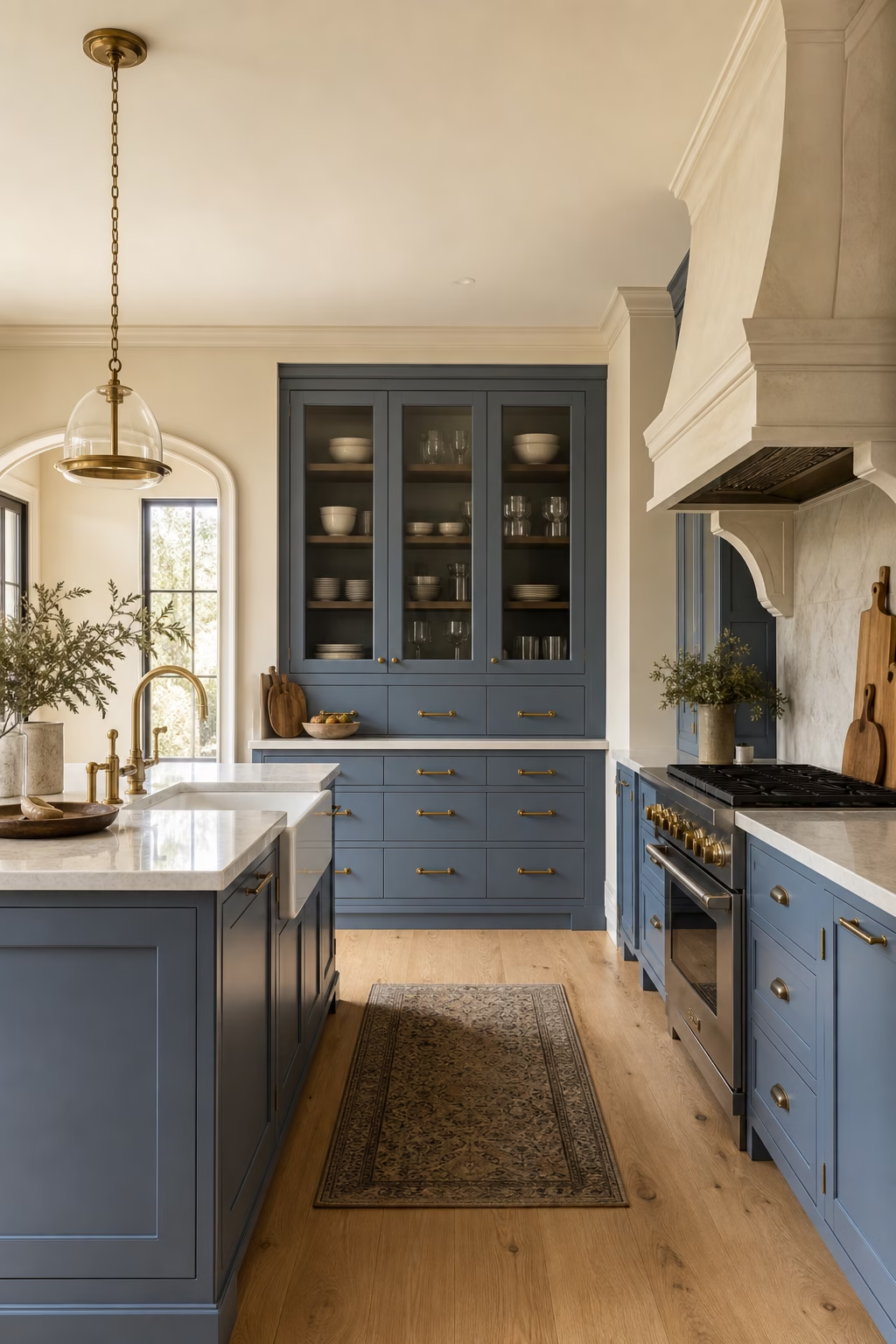
A coastal blue kitchen does not need rope lights, signs, or obvious nautical references. Start with a clear blue or blue-green cabinet color, then pair it with natural textures that feel authentic: oak, limestone, linen, woven stools, and unlacquered brass. Keep the lines clean and the styling restrained. A white plaster hood or pale stone backsplash can suggest brightness without turning the room into a theme. If the home is not near water, lean more toward relaxed natural materials than literal seaside details. The best coastal kitchens feel breezy because of light, proportion, and texture, not because they announce the idea.

Let a Blue Pantry Niche Add Depth
If a fully blue kitchen feels too much, paint the inside of a pantry niche, breakfast cupboard, or appliance garage. The color appears only when the doors are open, giving the room a private moment of depth. This works beautifully with warm white or oak exterior cabinetry because the blue feels discovered rather than dominant. Add interior lighting so the color reads clearly and the storage remains useful. The niche can hold coffee equipment, glassware, baking supplies, or bar pieces. A small saturated area often feels more luxurious than a large timid one, especially when the detailing is precise. Protect the base with stone.

Balance Blue Cabinets With Cream Walls
Blue and bright white can sometimes feel too crisp, especially in rooms with little natural warmth. Cream walls soften the contrast and make blue cabinetry feel more residential. Choose a cream that relates to the stone or floor rather than one that turns yellow. The combination works with navy, French blue, teal, and blue-gray, but the undertones need to agree. Brass, bronze, or warm nickel hardware can bridge the palette. Keep the ceiling lighter if the room is small so the space still lifts. Cream gives blue enough warmth to feel elegant at breakfast, during dinner prep, and under evening light.
Add a Blue Stone or Quartzite Counter
Blue stone is rare enough to feel special, but it must be used carefully. A blue-gray quartzite, subtly veined marble, or porcelain slab can make an island or backsplash unforgettable when the surrounding cabinets stay quiet. Avoid surfaces with artificial-looking color or overly busy pattern. The veining should connect to other materials in the room, such as gray floors, white plaster, or warm wood. Because blue stone draws the eye, keep edge profiles simple and avoid crowding the counter with decor. Used in one focused area, it gives the kitchen a custom, high-end quality without relying on painted cabinetry. Ask for full slab photos.

Paint Lower Cabinets Blue and Keep Uppers Light
Blue lower cabinets ground a kitchen while light uppers keep the room open. This is a useful strategy for narrow or medium-size spaces where all-over color might feel too heavy. Choose a deeper shade below, then use white, cream, pale oak, or glass-front upper cabinets above. The counter becomes the bridge, so select stone or quartz that contains both warm and cool notes. Align the hardware and reveals carefully so the two-tone approach looks designed, not pieced together. The darker base hides daily wear, while the lighter top lets daylight move across the room. Keep toe kicks simple and shadowed.
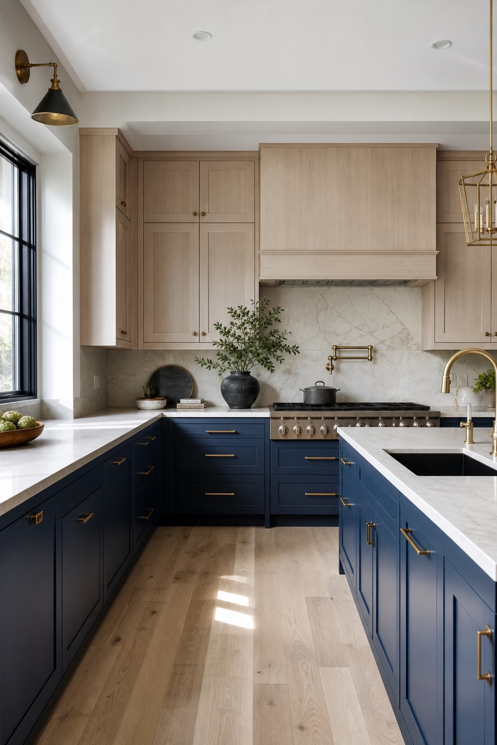
Use Teal Blue for a Rich Jewel-Box Mood
Teal blue can make a kitchen feel enveloping and luxurious when the room has enough light and the materials are chosen with restraint. Pair it with walnut, dark bronze, honed stone, and warm white walls rather than adding multiple competing colors. A satin finish helps the cabinets glow without becoming shiny. Teal is especially striking on a bar area, pantry wall, or island where the color can feel deliberate and contained. Keep the backsplash simple, and let texture come through wood grain, stone movement, and soft lighting. The result is dramatic, but still usable for everyday cooking. Good dimmers keep it flexible.

Frame Blue Cabinets With Marble-Look Slabs
Blue cabinets look more polished when the backsplash and counters are treated as one continuous frame. Marble-look quartz, porcelain, or natural stone with soft gray veining can outline the cabinet color and bring light back into the room. Run the slab behind the range or sink, then return it onto the counter for a tailored effect. The blue should be deep enough to hold its own beside the stone but not so dark that the veining disappears. Keep outlets discreet and avoid chopping the slab with unnecessary shelves. This pairing gives blue cabinetry a classic, architectural setting. Bookmatch only where it helps.

Choose Brass Hardware That Feels Quiet
Brass is a natural partner for blue, but the shape and finish decide whether it feels current. Choose slim pulls, small knobs, or integrated edge details in aged brass, champagne brass, or unlacquered brass if you welcome patina. Oversized shiny hardware can make blue cabinets feel theatrical. Repeat the metal in the faucet or lighting, but avoid scattering brass across every surface. The warmth should lift the blue rather than compete with it. In a well-balanced kitchen, the hardware reads like jewelry on a tailored coat: precise, useful, and considered, never the loudest part of the room. Scale each pull to the door.
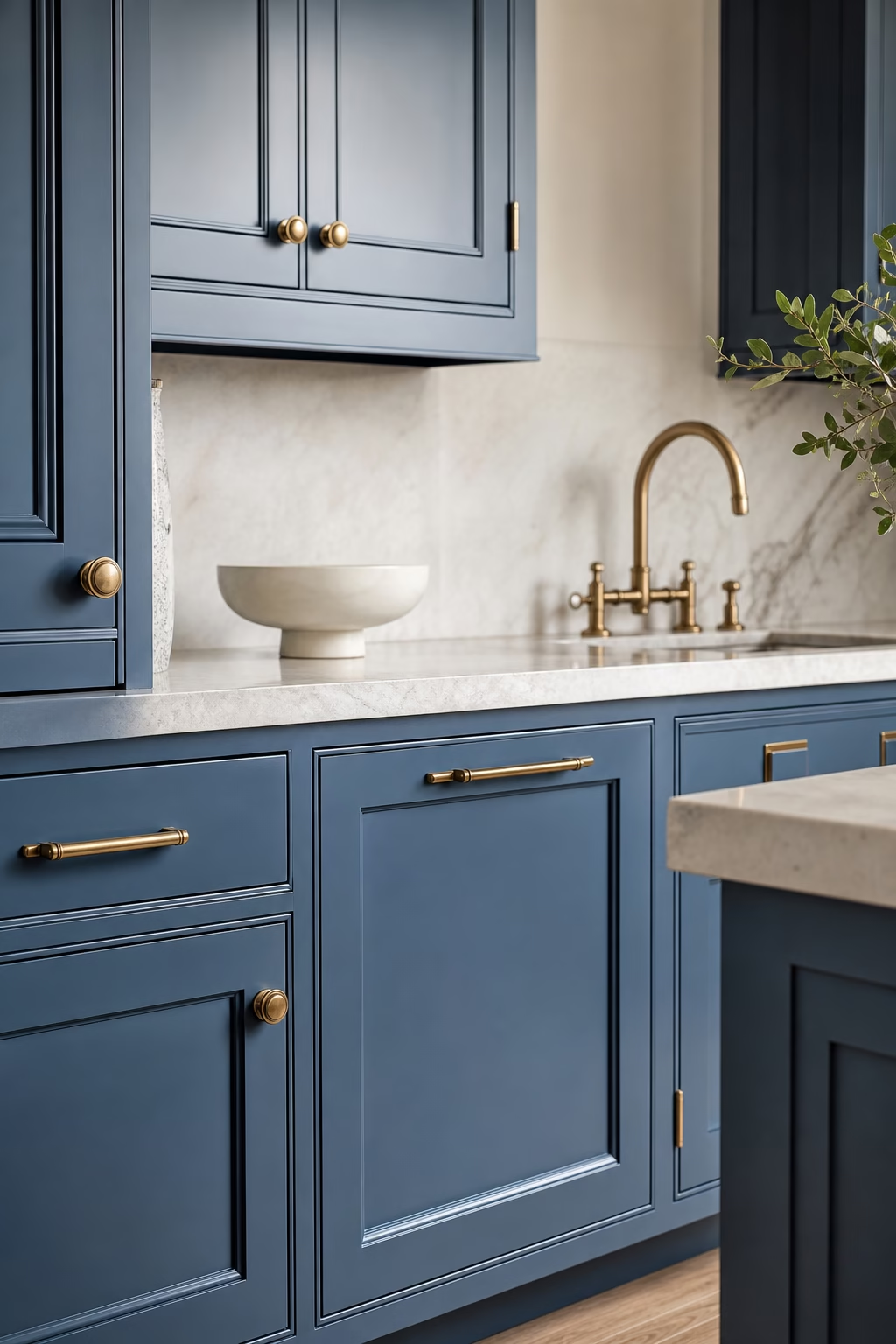
Use Blue Open Shelving as an Accent
Blue open shelving can add color without committing every cabinet front to it. Paint the shelves and the wall behind them in the same shade for a built-in look, or use blue shelves against white tile for a lighter effect. Keep the contents edited: everyday dishes, clear glass, a few ceramics, and enough negative space for the color to show. Shelves must be deep enough to be useful but not so deep that they crowd the counter. Add a small integrated light if the corner is dark. The result is functional display with a crisp color note, not clutter dressed as decor.

Combine Blue With Stainless for a Cleaner Edge
Blue kitchens do not always need warm metals. Stainless steel can make the palette feel crisp, professional, and slightly more modern. Use it on appliances, a range hood, toe kicks, or a worktable-style island, then keep the blue cabinetry saturated enough to stand beside the cool metal. Add warmth elsewhere through wood flooring, woven stools, or linen shades so the kitchen does not become clinical. Stainless is most convincing when it is practical, not decorative. In the right balance, it gives blue cabinets a clean working edge while preserving the comfort of a residential room. Avoid mixing too many metal finishes.
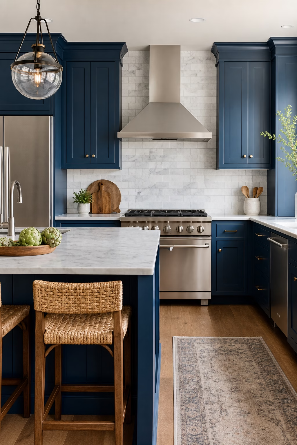
Use Pale Blue in a Small Kitchen
Pale blue can make a small kitchen feel open while giving it more character than plain white. Choose a shade with gray or green undertones so it sits comfortably beside stone, stainless, and wood. Keep the cabinet profiles simple, and use a light counter to avoid dividing the room into too many bands. If the space has limited daylight, add under-cabinet lighting and a reflective but not glossy backsplash. Pale blue works especially well in apartments, cottages, and narrow kitchens because it softens the edges. It should feel fresh, not sugary, so avoid overly decorative details. Let hardware stay especially quiet.
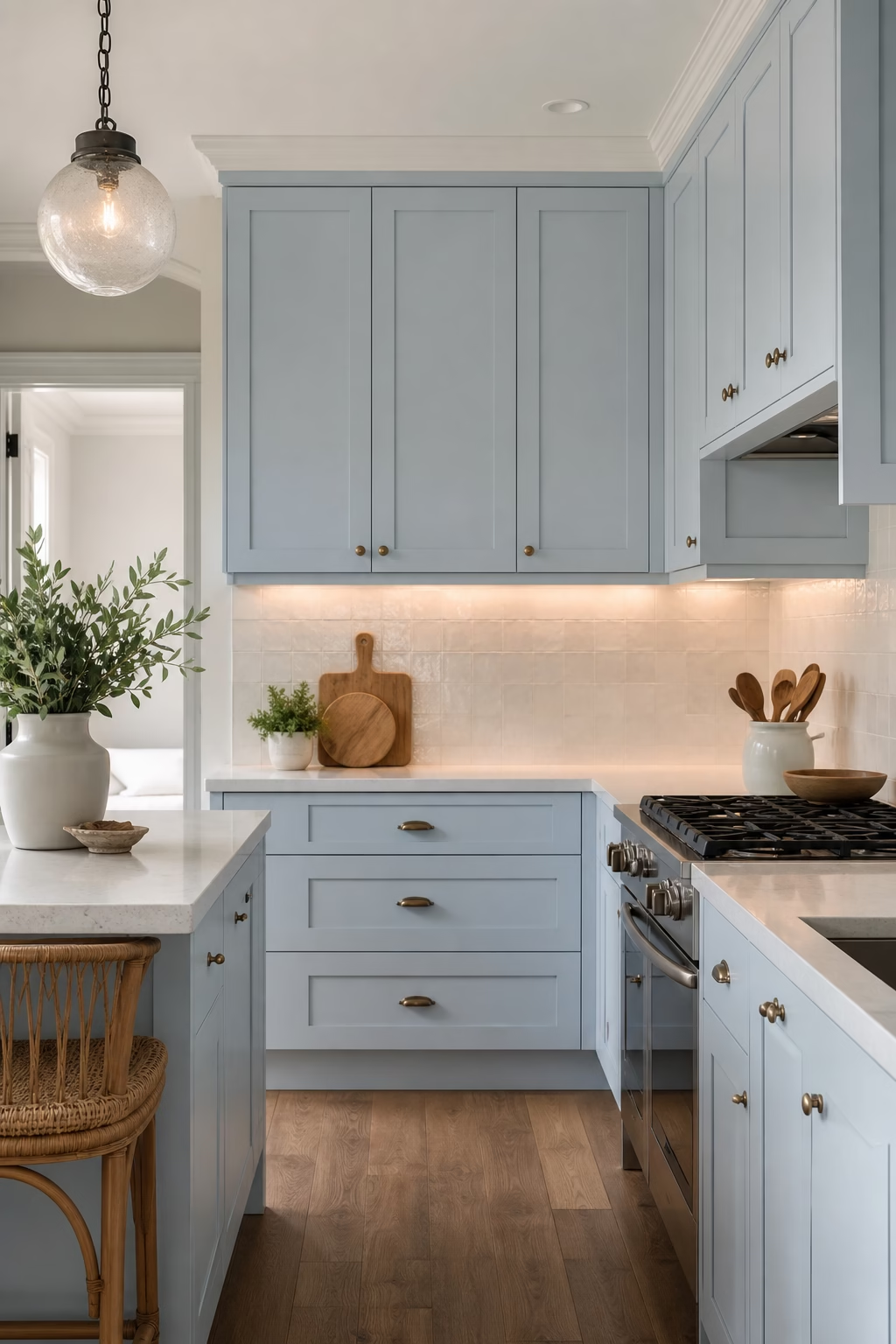
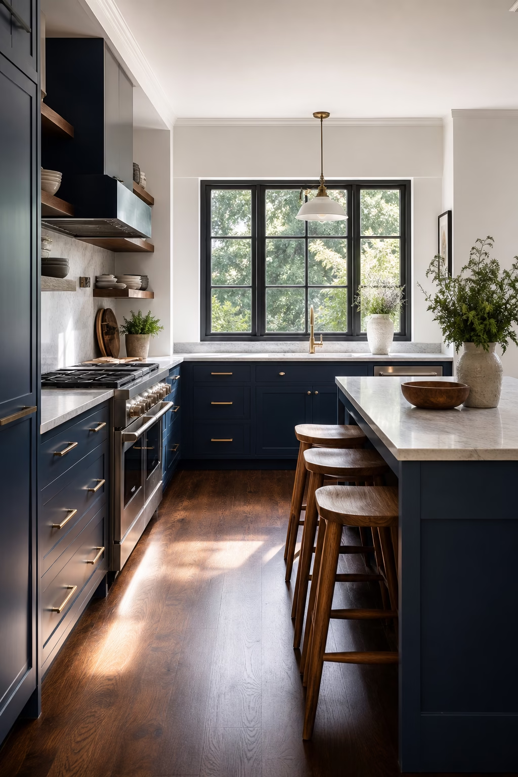
Anchor Blue Cabinets With Dark Floors
Dark floors can make blue cabinetry feel more substantial, especially in a larger kitchen that needs grounding. The key is contrast control. Pair navy, slate, or blue-gray cabinets with walnut, dark oak, charcoal stone, or smoked porcelain, then keep the walls and counters lighter. Use good lighting so the floor does not swallow the room. This approach feels tailored and slightly formal, but it still works for family life when the finishes are durable. Repeat a warm wood tone at stools or open shelves to connect the floor to eye level. The kitchen gains weight without feeling gloomy. Rugs can soften long runs.
Create a Blue Bar Area Beside the Kitchen
A blue bar or beverage area can carry the color story beyond the main work zone. Use it on a short run of cabinets with glass storage, an undercounter refrigerator, a sink if plumbing allows, and a stone counter that relates to the kitchen. Because the area is smaller, you can choose a richer blue or more dramatic hardware without overwhelming the room. Keep bottles and glassware organized so the bar does not become a cluttered corner. This is a useful way to make an open-plan kitchen feel layered, giving entertaining pieces a dedicated home away from the main prep counter.

Layer Blue With Patterned Floor Tile
Patterned floor tile can work with blue cabinetry when the scale and palette are controlled. Choose a pattern that includes blue, gray, cream, or charcoal rather than introducing unrelated colors. Let the cabinets stay simple so the floor has room to lead. This idea suits laundry-kitchen hybrids, cottages, and compact spaces where the floor is a strong visible plane. Keep the backsplash calmer and avoid busy counters. A matte tile finish is usually easier to live with and more sophisticated than a glossy one. When balanced carefully, the pattern adds personality while the blue cabinets keep the room structured. Use simple thresholds.

Use Blue Inside Glass-Front Cabinets
Painting the inside of glass-front cabinets blue gives a kitchen color and depth without changing the entire cabinet run. It works particularly well with cream, white, or oak exterior frames. The blue backdrop makes white dishes, glassware, and ceramics look more intentional. Add discreet cabinet lighting so the color reads in the evening and the shelves do not feel dark. Keep the display edited and practical; crowded glass cabinets quickly lose their elegance. This detail is subtle from across the room but rewarding up close. It is a polished choice for anyone who wants blue with a lighter overall footprint.

Finish With Blue Textiles and Ceramics
If permanent blue feels risky, finish the kitchen with textiles and ceramics that can evolve. A blue runner, linen shade, ceramic vase, hand-thrown bowl, or upholstered counter stool can shift the mood without repainting cabinets. The pieces should relate to the room's undertones rather than competing with them. In a warm kitchen, choose dusty denim or blue-gray; in a crisp white kitchen, clearer blue may work. Keep the number of accents limited so the color feels intentional. This is also the easiest way to refresh a kitchen seasonally while preserving the architecture, storage, and expensive surfaces already in place. Edit pieces as seasons change.