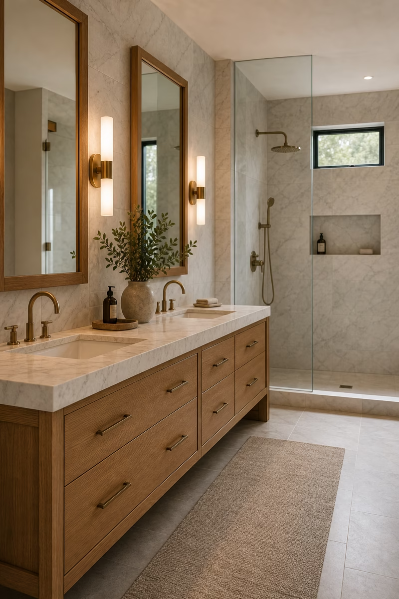
Neutral bathrooms feel most luxurious when the palette is layered with texture, warmth, and practical details rather than left flat.
Layer Three Shades of White
A neutral bathroom should never depend on one flat white. Layering several related whites gives the room depth while keeping it calm. Use a warm white on the walls, a slightly creamier tone in the tile, and a crisp but not blue-white sink or tub. The difference should be subtle enough to feel natural, not mismatched. Test samples beside the actual window light and bulbs because whites can turn grey, yellow, or pink quickly. When the undertones agree, the bathroom feels soft and expensive. Add texture through plaster, towels, or stone so the palette reads layered rather than blank or unfinished.
Choose Honed Stone Over Glossy Surfaces
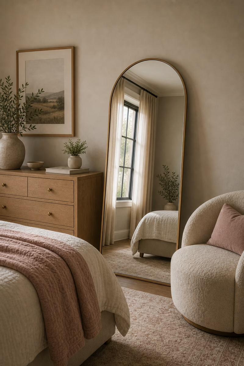
Spa-like bathrooms usually feel grounded because the surfaces absorb light gently instead of bouncing it everywhere. Honed marble, limestone, travertine, or stone-look porcelain can give a neutral room that quiet luxury. The finish should be smooth to the touch but not shiny, with natural movement that feels subtle rather than dramatic. If real stone is not practical, high-quality porcelain can create a similar mood with easier maintenance. Use the stone on the floor, shower walls, or vanity backsplash, then let other elements stay restrained. A honed surface makes the room feel calmer because shadows settle softly across it. It also photographs beautifully because matte texture gives daylight somewhere soft to land.
Warm the Palette With Pale Oak
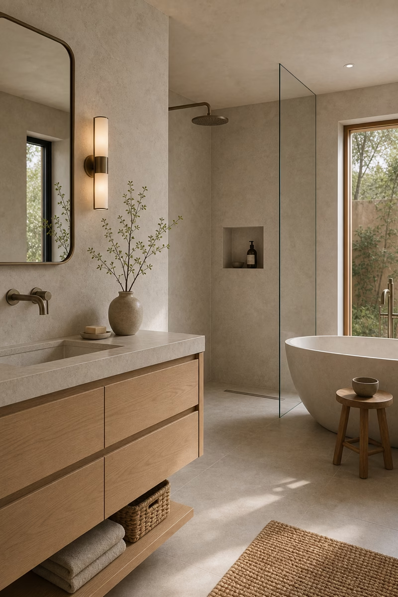
Wood is what keeps many neutral bathrooms from feeling sterile. Pale oak works especially well because it adds warmth without turning the palette dark. Use it for a vanity, mirror frame, stool, or linen cabinet, then repeat the tone once so it feels connected. The grain should be calm and sealed properly for bathroom humidity. Pair oak with warm white tile, brushed nickel, aged brass, or limestone rather than icy grey finishes. The goal is not rustic character; it is quiet warmth. Even one well-proportioned oak vanity can make stone and porcelain feel more livable. That quiet repetition helps the palette feel designed rather than accidentally beige.
Use Greige for a Softer Wall Color
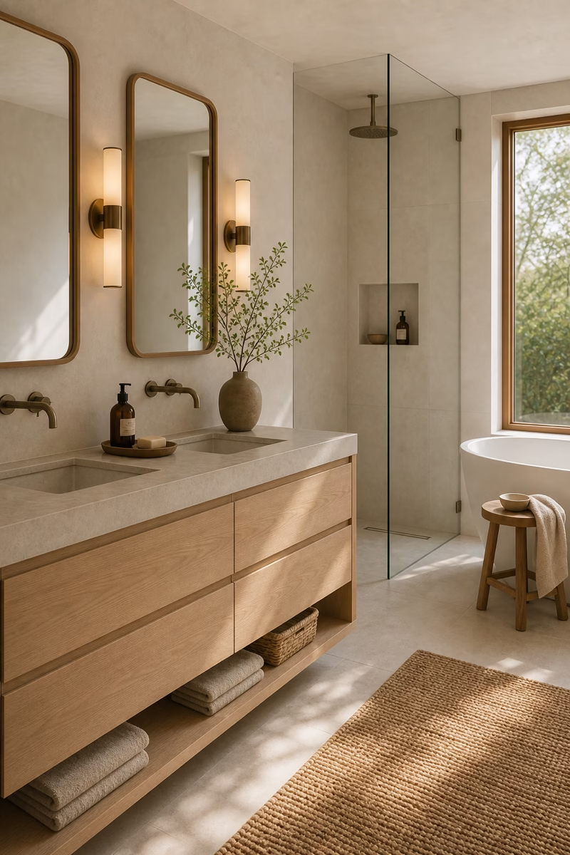
Greige can be a beautiful bathroom wall color when white feels too sharp and beige feels too traditional. Look for a shade with enough warmth to flatter skin tones but enough grey to stay modern. In a bathroom with natural stone, greige walls can connect veining, tile, and cabinetry without demanding attention. Keep the ceiling lighter if the room is small, and test the paint near mirrors because reflected tile can change the color. Greige works particularly well with aged brass, warm nickel, and pale wood. It gives the room a quiet envelope that feels more restful than bright white.
Bring in Texture With Linen Towels
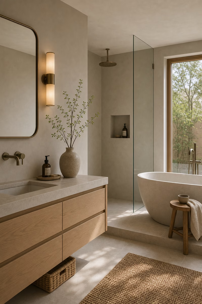
Textiles are small, but they strongly influence whether a neutral bathroom feels flat or inviting. Choose linen, waffle cotton, Turkish cotton, or a softly ribbed towel in oatmeal, warm white, stone, or taupe. The texture matters more than a strong color. Fold towels neatly on a shelf, drape one beside the tub, or hang them on simple hooks where they can dry properly. Avoid too many competing weaves in a compact room. In a spa-like bathroom, textiles should look relaxed but cared for. They soften tile, glass, and metal while reinforcing the calm palette. Choose quick-drying weights so the softness still works in everyday use.
Install Layered Lighting on Dimmers
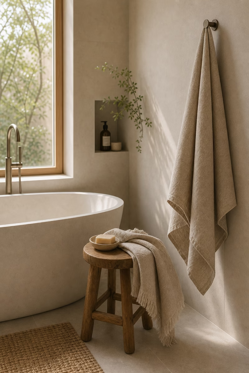
Neutral bathrooms depend on light because pale surfaces reveal every shadow and undertone. Start with practical overhead lighting, then add sconces or backlit mirrors at face height for flattering grooming light. A small accent under a floating vanity or inside a niche can create a gentle evening mood. Put every layer on dimmers so the room can shift from bright morning routine to quiet bath retreat. Choose warm bulbs rather than cool blue light, especially near stone and beige finishes. The best neutral bathroom lighting feels calm, flexible, and integrated with the architecture. Good controls matter as much as fixture style in a room used daily.
Try a Taupe Vanity for Quiet Depth
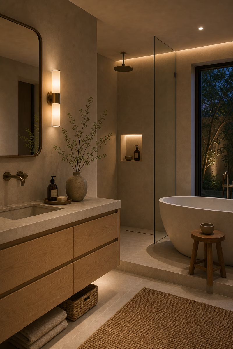
A taupe vanity can add depth to a neutral bathroom without breaking the calm mood. It works well when walls and tile are lighter, giving the room a grounded center. Choose a taupe with grey, mushroom, or clay undertones depending on the stone already in the space. Flat-front doors feel more contemporary, while slim shaker fronts can suit a transitional home. Keep the counter pale and the hardware refined so the vanity does not become heavy. Taupe is especially useful in guest baths because it hides wear better than white while still feeling soft and elevated. It also pairs easily with seasonal towels without changing the whole room.
Use a Freestanding Tub as a Calm Focal Point
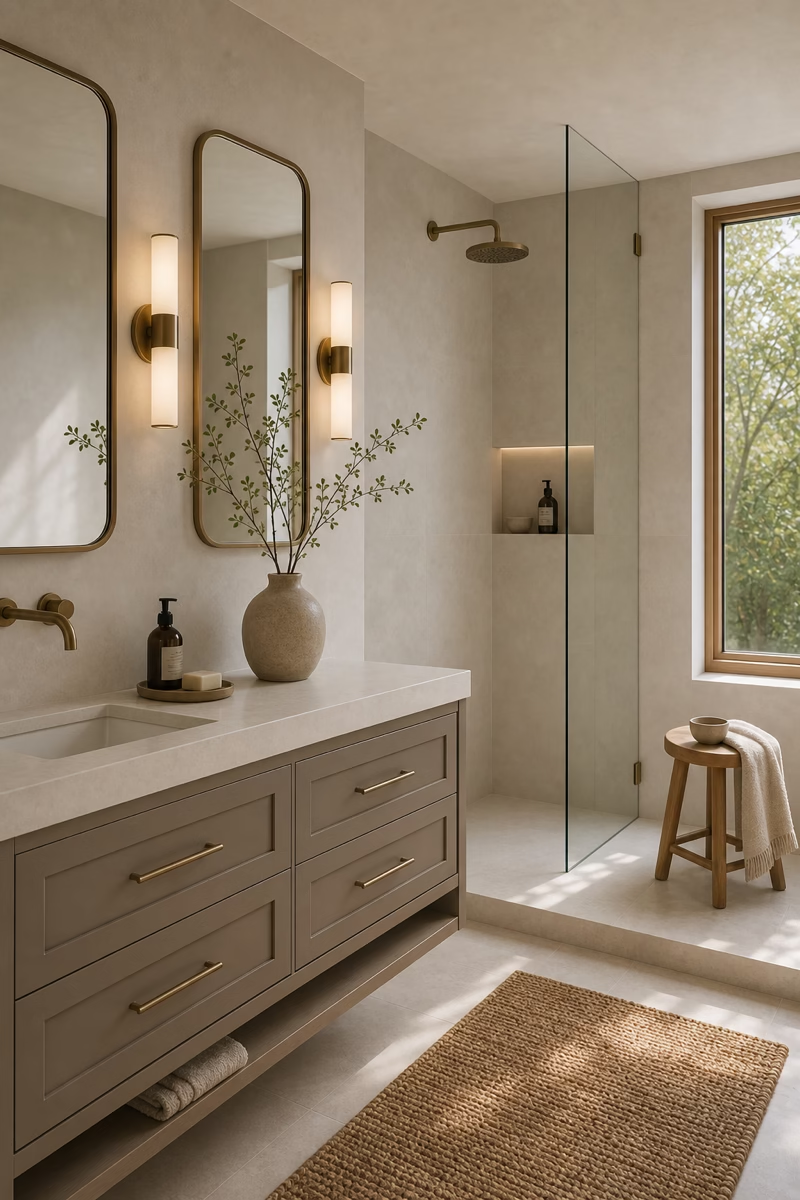
A freestanding tub can anchor a neutral bathroom when it has enough space around it. Place it near a window, under a quiet plaster wall, or in front of a simple stone backdrop. The shape should relate to the room: oval for softness, rectangular for a more architectural look. Keep the surrounding styling minimal with a small stool, folded towel, and perhaps one vessel. The tub should not block circulation or crowd the vanity. In a spa-like retreat, the focal point works because the proportions are generous and the materials around it stay restrained. Leave a clear landing surface nearby so the bath ritual feels effortless.
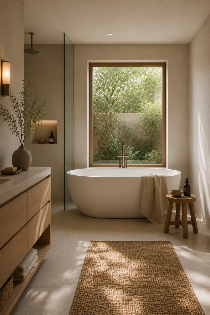
Mix Brass With Creamy Stone
Aged brass brings warmth to neutral bathrooms, especially when the palette leans cream, limestone, or taupe. Use it for sconces, cabinet hardware, or a tub filler, then keep plumbing profiles simple. The finish should feel soft and brushed rather than shiny yellow. Brass works best when repeated in a few deliberate places, not scattered everywhere. Against creamy stone, it adds a quiet glow that makes the room feel more collected and less clinical. If you prefer cooler metals, warm nickel can create a similar effect with a softer contrast. The important thing is consistency and restraint. Repeating the metal near eye level keeps the warmth visually balanced.

Keep the Shower Glass Clear and Simple
In a neutral bathroom, the shower should support the larger sense of calm rather than become a heavy enclosure. Clear frameless glass keeps stone, tile, and daylight visible across the room. If privacy is needed, consider ribbed or lightly frosted glass on one panel, but avoid busy grids in a very serene palette. Make sure the door swing, curb, slope, and drainage are planned carefully so the clean look works in real life. Simple glass also lets towels, wood, and stone create the warmth. The room feels larger because nothing interrupts the material story. Good glass detailing is what makes the simplicity feel finished.
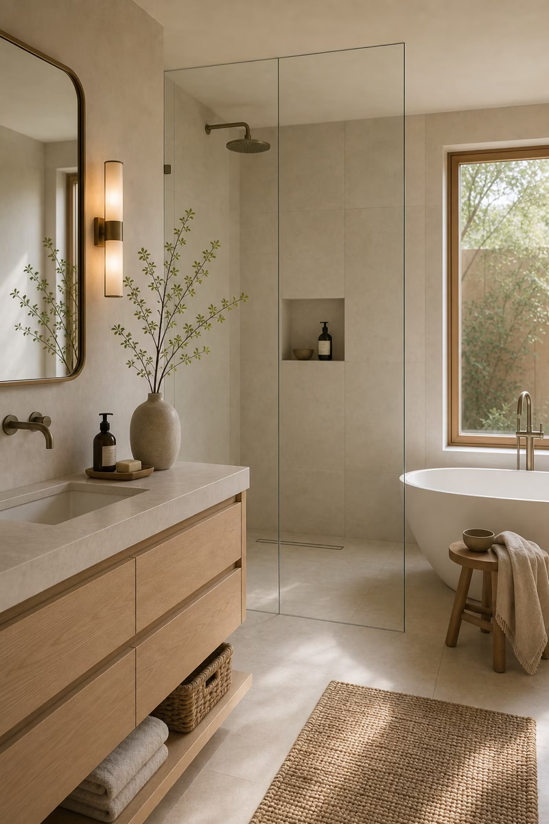
Add a Plaster Finish for Subtle Movement
Limewash, tadelakt-inspired finishes, and fine plaster can add beautiful movement to a neutral bathroom. The surface catches light differently throughout the day, which keeps a simple palette from feeling static. Use the finish on dry walls, a vanity backdrop, or carefully detailed wet zones only when the product and installer are appropriate for moisture. Choose colors like bone, chalk, sand, or mushroom. Pair plaster with smoother tile and clean cabinetry so the room remains refined. The appeal is quiet imperfection: a soft hand-applied texture that feels human without becoming decorative. It is especially effective beside mirrors, where reflected light reveals depth.
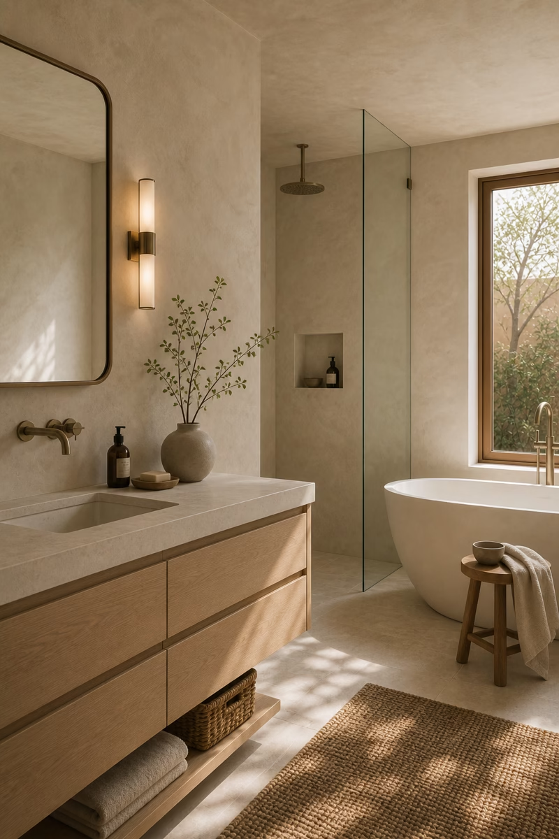
Use Baskets Only for Real Storage
Natural baskets can warm a neutral bathroom, but they should not become filler. Use them where they solve a storage problem: under an open vanity shelf, inside a linen cabinet, or beside a tub for rolled towels. Choose consistent fiber color and simple shapes so they feel intentional. Keep baskets away from wet splash zones and avoid filling every open surface. In a spa-like room, the basket should look useful, not staged. The woven texture introduces a natural note that balances stone and porcelain while helping the bathroom stay organized. Closed storage should handle the less attractive backup supplies nearby.
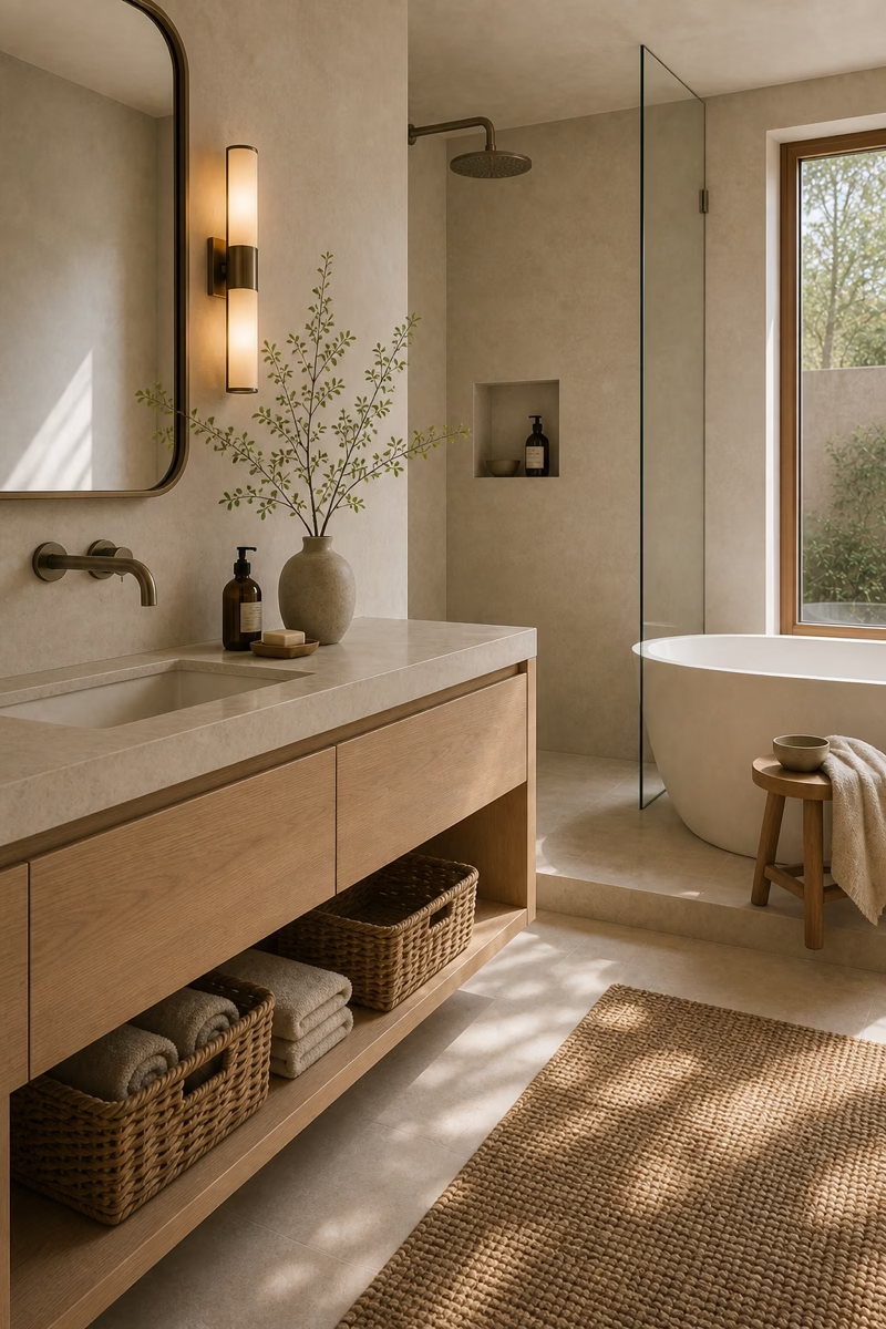
Choose a Large Neutral Rug Carefully
A rug can soften a neutral bathroom, but it needs the right scale and material. In front of a double vanity, a long runner in washable cotton, wool-look performance fiber, or flatweave texture can make the room feel more furnished. Keep the color close to the palette: oatmeal, stone, warm grey, or faded taupe. Avoid thick rugs in wet zones or anything that blocks a door. A small bath mat can feel choppy in a larger bathroom, while one appropriately scaled textile makes the room feel more intentional. The softness underfoot reinforces the retreat-like atmosphere. Use a quality pad beneath it so the textile stays flat and safe.
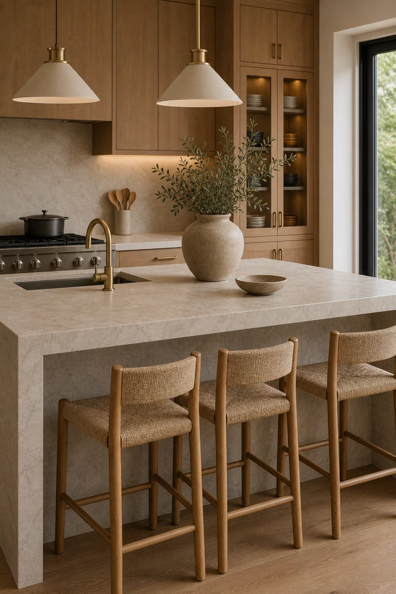
Let Veining Stay Soft and Natural
Stone veining can be beautiful in a neutral bathroom when it feels organic rather than theatrical. Choose marble or porcelain with gentle movement in beige, grey, cream, or taupe. Use stronger veining on one surface, such as a vanity backsplash or shower wall, and keep adjacent materials quieter. Bookmatched slabs can look luxurious, but they need enough room and careful placement to avoid a forced pattern. For a calming retreat, the eye should drift across the stone, not stop abruptly at high-contrast lines. Soft veining adds depth while preserving the peaceful mood. This restraint lets the stone feel natural rather than overly staged.
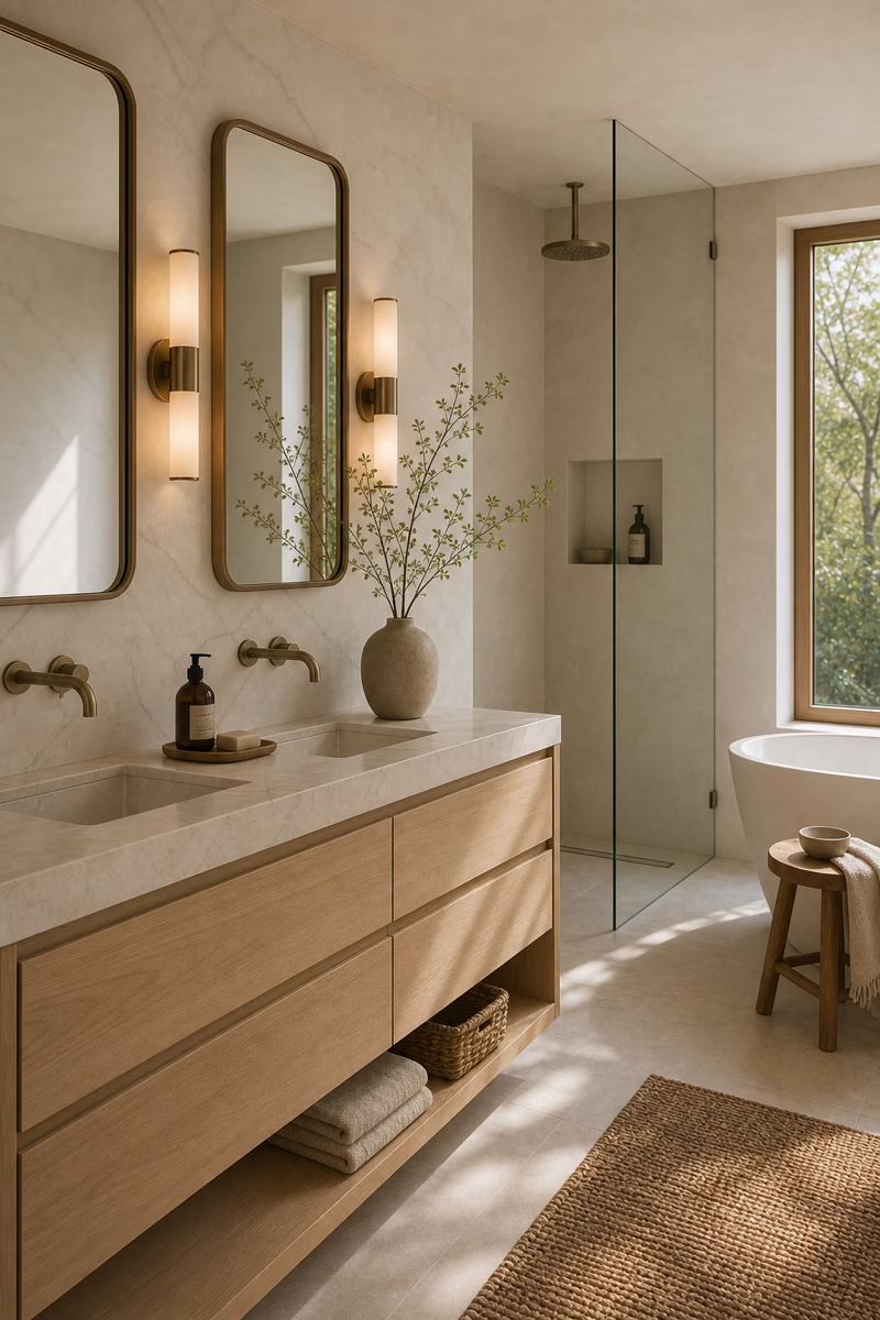
Style With Ceramic and Stone Accessories
Accessories in a neutral bathroom should feel tactile and useful. Ceramic trays, stone soap dishes, matte dispensers, and simple glass jars can organize the counter without adding visual noise. Choose two or three pieces in related tones rather than a collection of mismatched objects. A stone tray can hold soap and a small brush; a ceramic cup can corral toothbrushes in a guest bath. Avoid labels, bright packaging, and overly decorative figurines. The best accessories support the rituals of the room while echoing its materials. They should make the bathroom easier to use, not busier. Editing the palette of accessories is what keeps the counter calm.
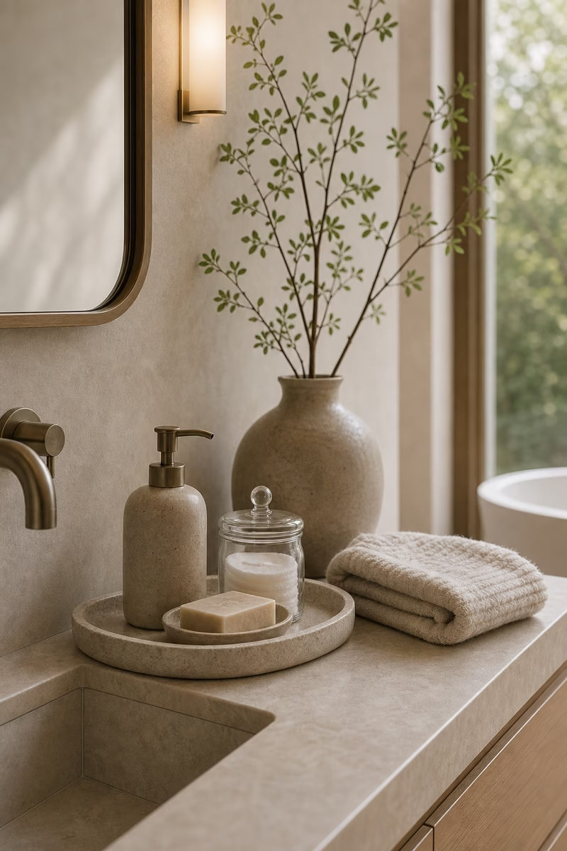
Bring Nature Through a Single Branch
A spa-like bathroom does not need a large floral arrangement. One branch, a few eucalyptus stems, or a small sculptural plant can add life while keeping the room restrained. Place it where it will not crowd the sink or interfere with cleaning, such as on a tub ledge, vanity corner, or stool near a window. Use a matte ceramic, stone, or clear glass vessel in the same neutral family. The organic line breaks up all the straight architecture and makes the space feel fresh. Restraint is what keeps the greenery elegant rather than decorative clutter. Fresh greenery also makes warm neutrals feel cleaner in afternoon light.
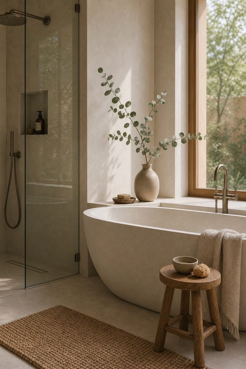
Use Fluted Details for Quiet Shadow
Fluted wood, ribbed glass, and reeded cabinet fronts create shadow without adding strong color. In a neutral bathroom, that kind of texture can be more sophisticated than pattern. Use it on one main feature, such as a vanity face, shower panel, or linen cabinet, then let surrounding surfaces stay smooth. The scale of the fluting should suit the room; very tight ridges can feel busy in a small bath, while broad reeding reads calmer. Natural light will bring the detail to life throughout the day. The room remains neutral, but it has depth and a custom feel. Keep nearby hardware plain so the shadow detail remains the feature.
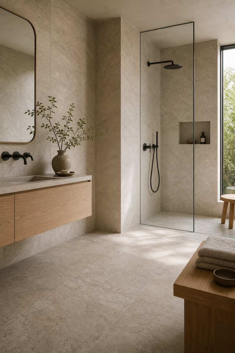
Keep Hardware Profiles Slim
Neutral palettes can feel heavy if the hardware is bulky or overly ornate. Slim pulls, simple knobs, narrow towel bars, and clean faucet shapes help the room stay quiet. Choose one or two metal finishes and repeat them with purpose. Brushed nickel feels soft and timeless, aged brass adds warmth, and dark bronze can provide subtle contrast without the sharpness of black. The profile matters as much as the finish; a thin bar pull can make a vanity feel tailored, while oversized hardware may dominate it. In a calming bathroom, small details should support the whole composition. Consistent mounting heights make those slim pieces look even more deliberate.
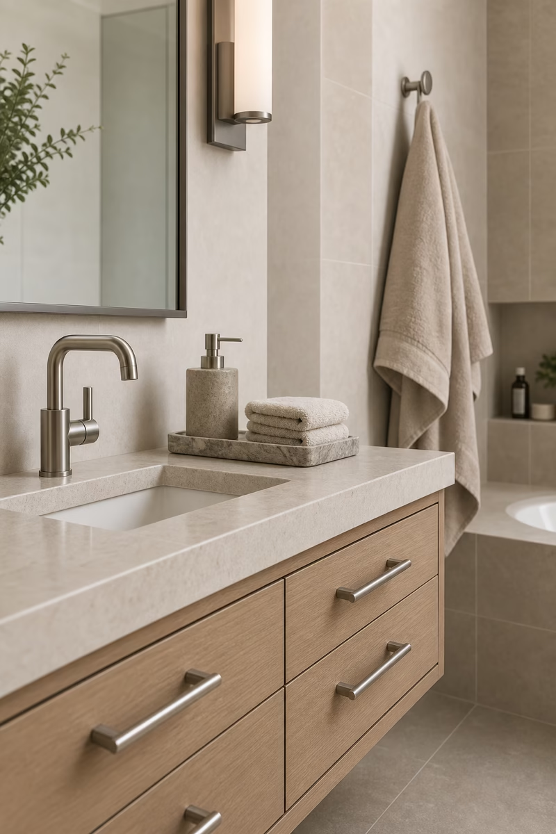
Create a Built-In Bath Ledge
A built-in ledge can make a neutral bathroom feel architectural and practical. Run it behind a tub, along a shower wall, or above a vanity to hold soap, towels, or one simple vessel. Finish it in the same stone or plaster as the wall so it feels integrated. The ledge should be deep enough to be useful but not so deep that it collects clutter. In a spa-like room, this detail replaces freestanding furniture and keeps essentials close without interrupting the clean lines. It also creates a natural horizontal shadow that gives pale walls more depth. It can also hide small bottles without adding a separate organizer.
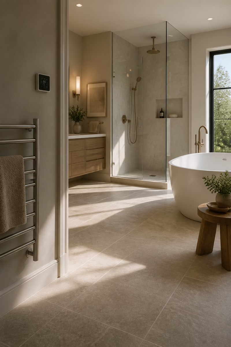
Balance Beige With Crisp White Fixtures
Beige and sand tones can be deeply calming, but they need a little crispness to avoid looking dull. White fixtures provide that lift. A clean white tub, basin, or toilet can sharpen a warm neutral palette while still feeling soft. The trick is to choose whites that are not icy blue and to connect the beige tones through stone, towels, or cabinetry. Add a restrained metal finish and natural wood for balance. When beige is supported by clear white shapes, the room feels fresh, not dated. The contrast is gentle enough for a retreat but defined enough for everyday clarity.
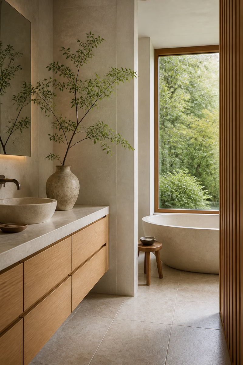
Finish With Spa-Like Negative Space
The most calming neutral bathrooms leave room for the eye to rest. That means empty counter space, clear shower glass, uncrowded shelves, and walls that do not need art on every surface. Negative space is not wasted space; it is what allows stone, wood, light, and texture to feel luxurious. After the room is styled, remove one or two objects and see whether the design improves. Keep only the pieces that serve a function or strengthen the atmosphere. A neutral retreat succeeds when the materials feel generous and the daily objects are edited with care. That final edit is what makes the room feel restorative, not sparse.